A Richoco project · FinTech · Education lending
AfriCred
From a pitch deck to 10,000+ users within six months of launch.
Product strategy, brand and UX for an education lender working in four African countries and the UAE.
- AfriCred (now GlobCred)
- FinTech · Education lending
- Product strategy, Brand identity, UX research, UI design, Design system, Product management
- 4.5 months, idea to MVP
- 3 engineers (frontend, backend, mobile) and 1 QA analyst
- 10,000+
- users within six months of launch
- $6M+
- in student loans paid out
- 2,000
- successful global admissions
- 35%
- higher onboarding completion than the old Google Form and Excel process
The brief
AfriCred started as a pitch deck, a Google Form and a spreadsheet
Interest in studying abroad keeps growing, but millions of young Africans can't get a student loan or an affordable, secure way to send money. AfriCred set out to change that.
When we started, students applied through a Google Form. The team worked every application by hand in Excel, and approving a loan took weeks. There was no product, no brand and no visual identity yet.
We built AfriCred from the ground up. That meant the product vision and brand, research and journey mapping, UX strategy, interface design and the design system. We also led the team across design, development and compliance through to launch.
Chapter
We agreed on three principles before designing anything: access, clarity and trust.
Research
Trust was fragile, so every screen had to earn it
We interviewed:
- 10 students exploring loans or scholarships
- 6 parents and guardians paying for study abroad
- 3 diaspora professionals using informal remittance networks
- 2 local financial institutions and regulatory experts
What we heard:
- Many students were intimidated by debt and said they'd had little loan education.
- Remittance users were tired of hidden fees, vague timelines and clumsy apps.
- People trusted word of mouth over platforms, even when word of mouth wasn't safe.
- A financial platform looked like government paperwork until it proved otherwise.
Key decisions
The product replaced the spreadsheet
- 01
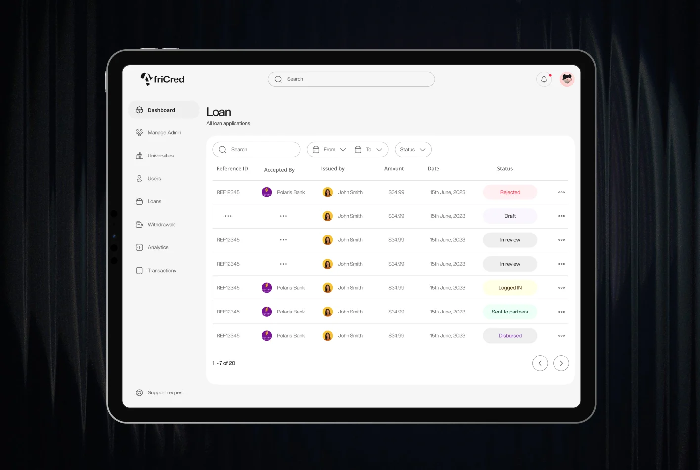
A loan console for the admin team
Every application went through a manual Excel process, and approval took weeks.
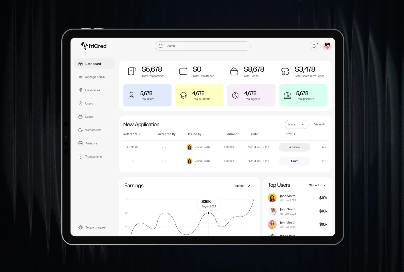
A loan management dashboard where admins see each application as it arrives and act on it straight away.
Approval went from weeks to days.
- 02
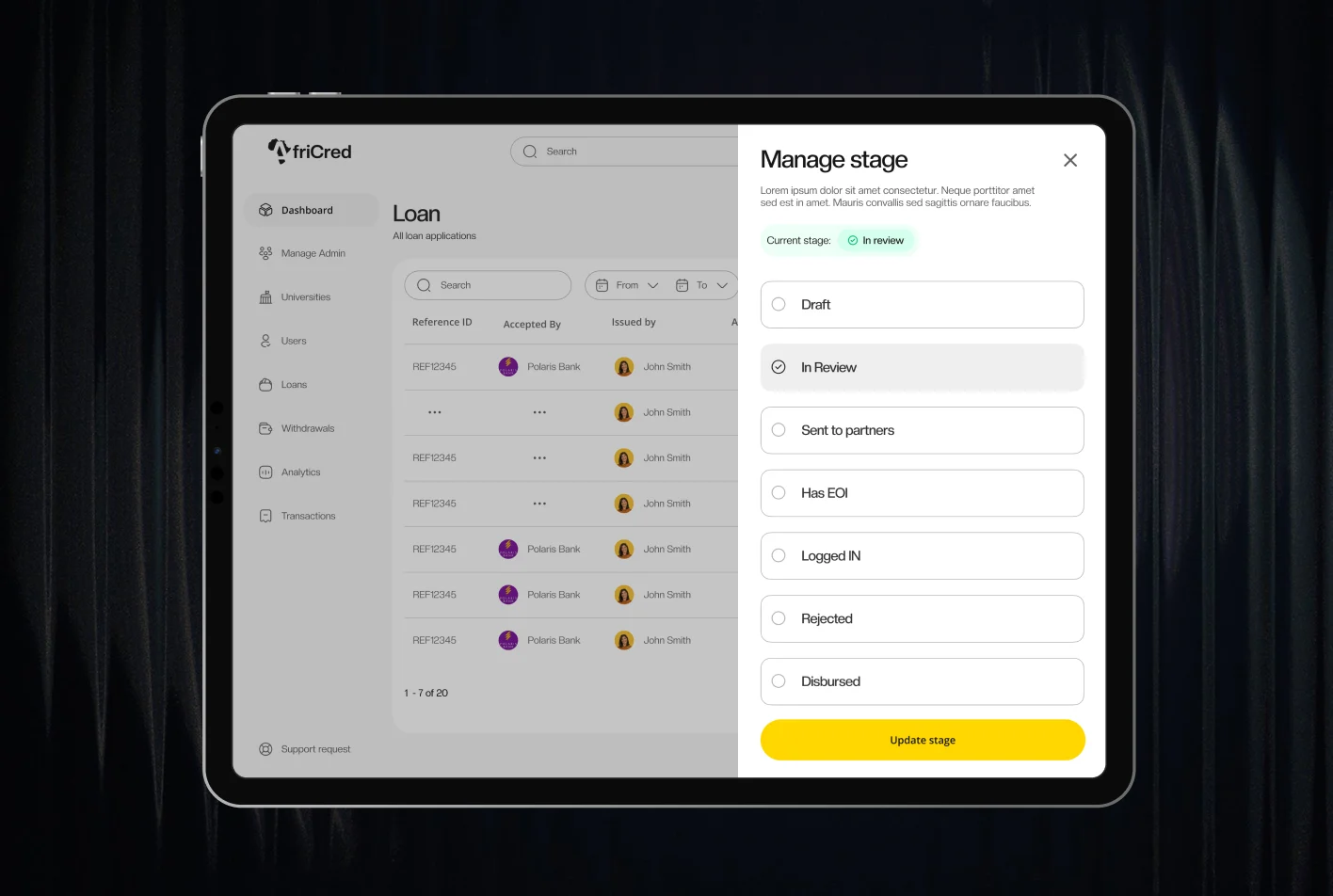
The stages, automated
AfriCred already worked in stages, but every move was manual, and applications dropped out between them.
A staged timeline that carries each application from review, through partner lenders, to disbursement. Admins move it forward, and the borrower follows the same stages from their side.
The hand-offs where applications got lost now run as an automated workflow.
- 03
Onboarding inside the product
Students applied through a Google Form, and their answers were processed in Excel.
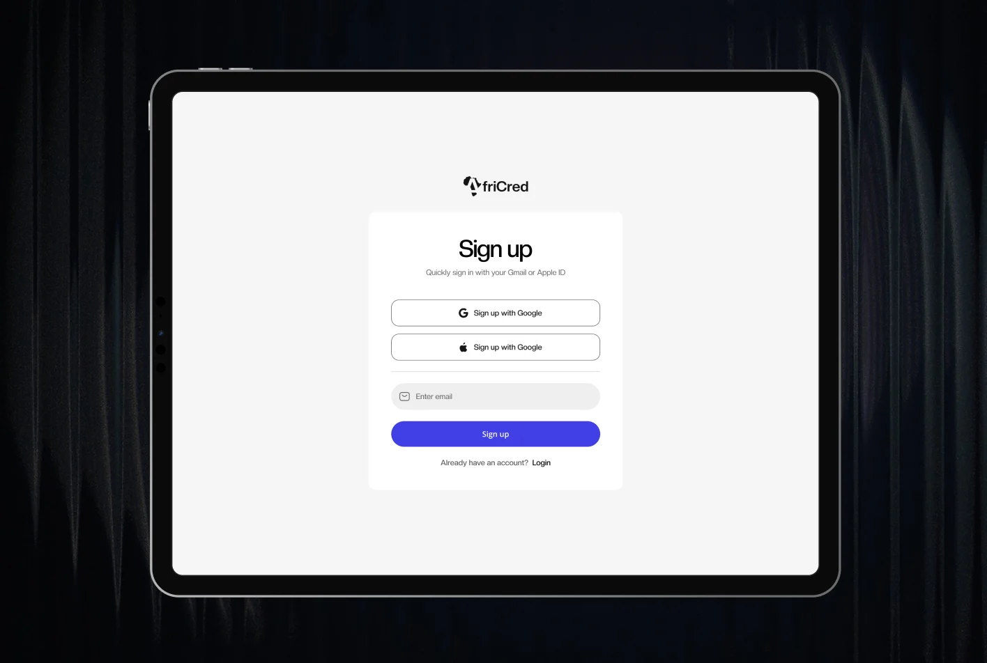
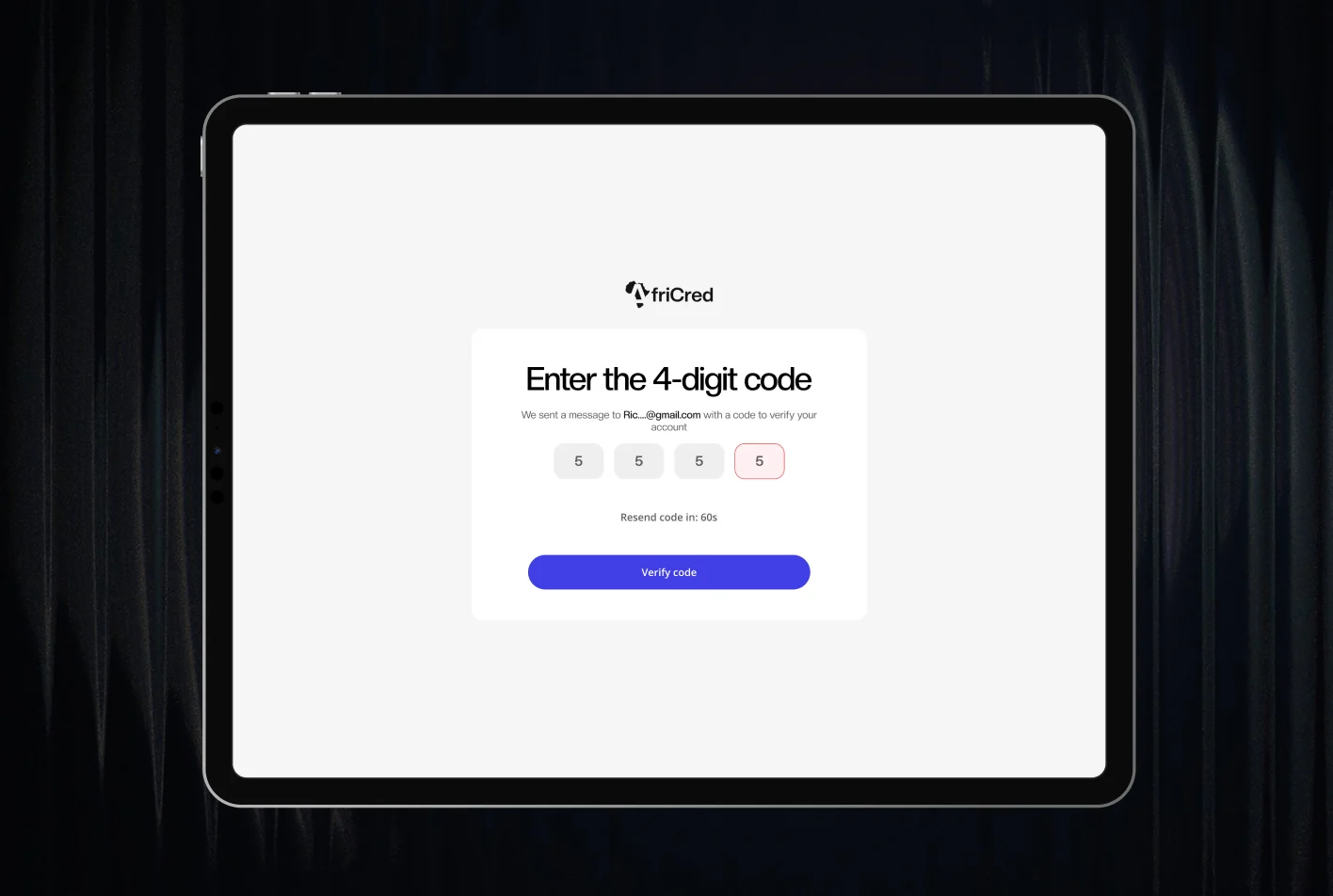
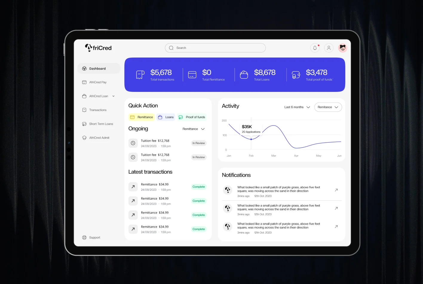
A guided application. Students reach their dashboard before verification finishes, check their status there, complete anything pending, and more of the product opens up as they go.
Onboarding completion rose 35% over the Google Form and Excel process.
- 04
Fees and conversion shown where you pay
Research showed hidden fees and vague timelines frustrated remittance users.
Currency conversion and the processing fee appear at the last step, when the student pays tuition, beside a preview of the whole application.
The hard part
Payments across five countries were the hardest problem
Making payment and currency conversion work in five countries was the toughest challenge on the project, and it demanded substantial interface changes. We started on Stripe and moved to Flutterwave.
Architecture
A student loan and a money transfer are different jobs
So we designed two separate paths instead of one generic flow.
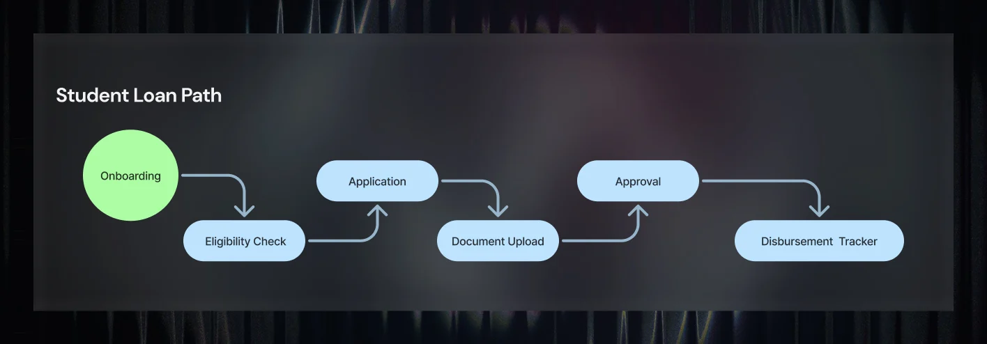
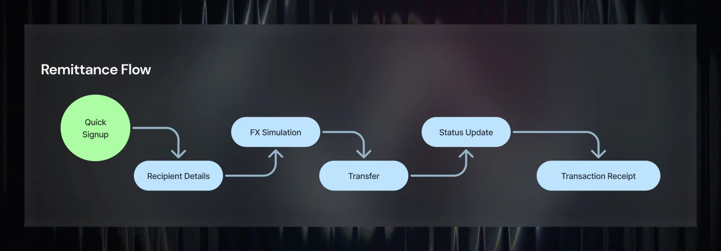
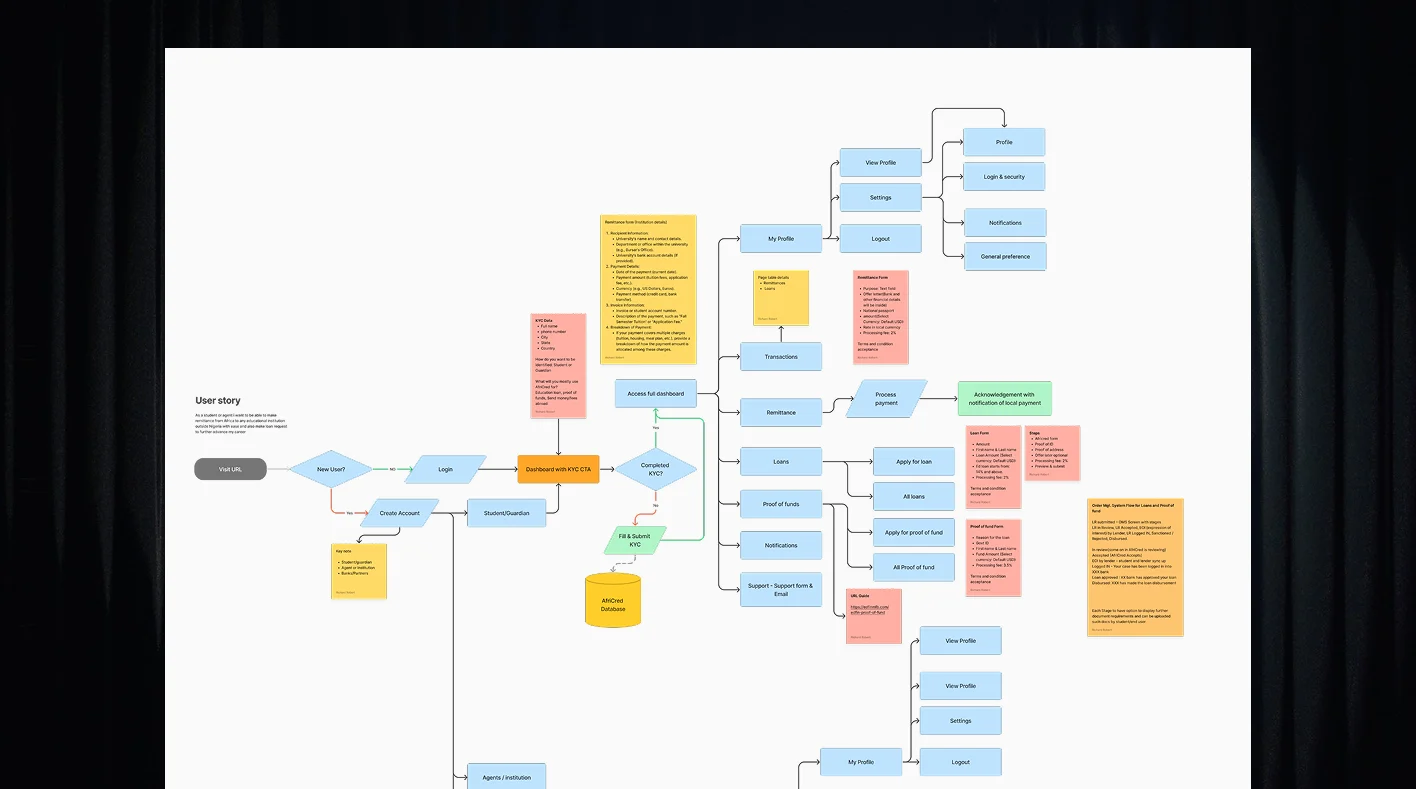
Our research persona, Moses, is 22, from Ibadan, heading to Canada for a Master's in Public Health, and uses an Android phone every day.
Brand
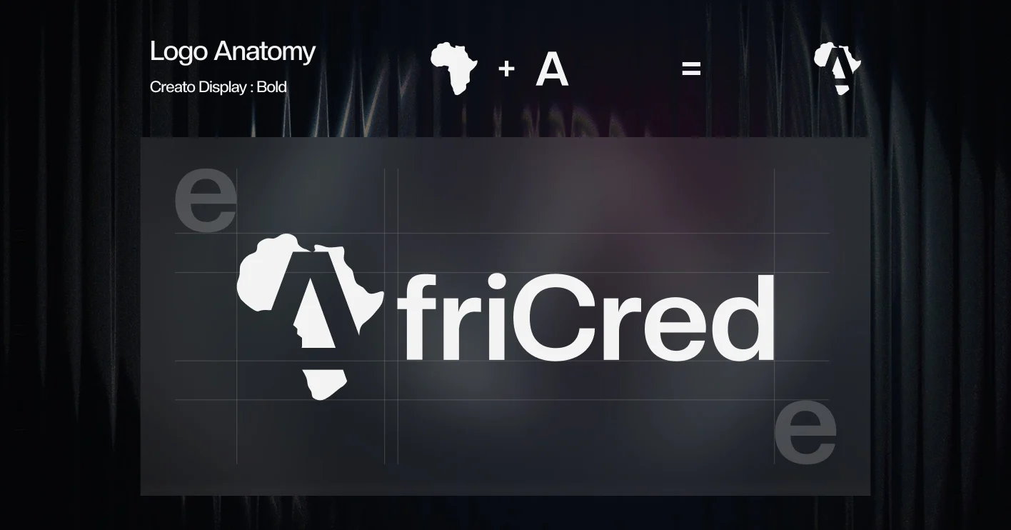
A brand built for trust, starting with the name
We led the identity from a naming workshop onwards.
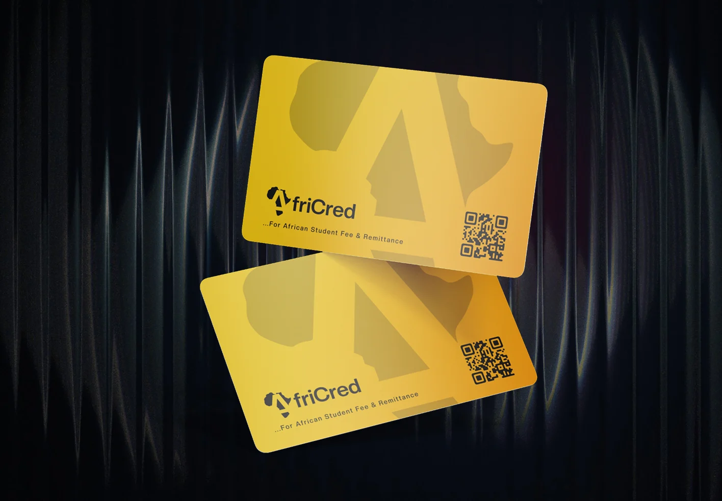
- Mark: the map of Africa combined with the letter A, for inclusion, growth and trust.
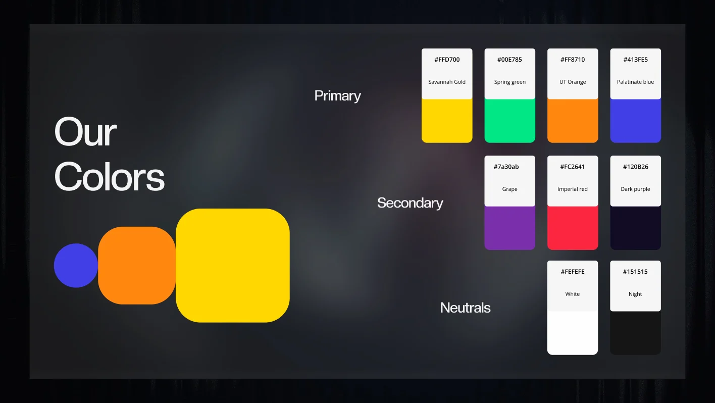
- Colour: deep greens and blues for financial security, with a warm yellow for optimism.
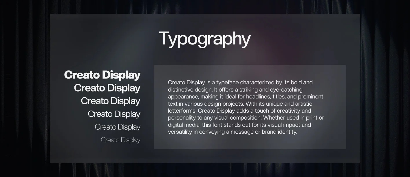
- Type: Creato Display, with bold weights kept for hierarchy.
- Voice: calm, encouraging and informative, never stiff.
- Guidelines so marketing, onboarding and future landing pages stay consistent.
Interface
Help sits where people get stuck
- Help built into the forms, with tooltips and modals where questions come up.
- Real-time validation for bank details, KYC uploads and loan terms.
- "Verified Partner" and "Secure Transfer" badges, timeline indicators, and careful error handling at the points where people used to drop off.
- Micro-interactions that give feedback and build trust.
- A modular component system for cards, buttons, inputs and progress trackers, shared across web and mobile.
- Designed web-first and fully responsive, for students who live on their phones.
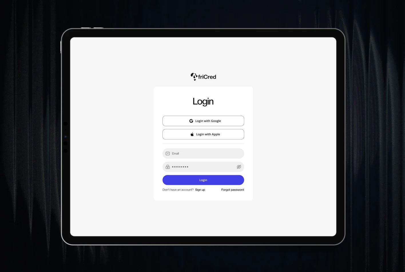
Sign-in to dashboard
Sending money
The amount, the conversion and the purpose, then a preview of every detail before the transfer goes.
Student loans
A step-by-step application, a table of every loan, and a tracker for each stage up to disbursement.
Admin
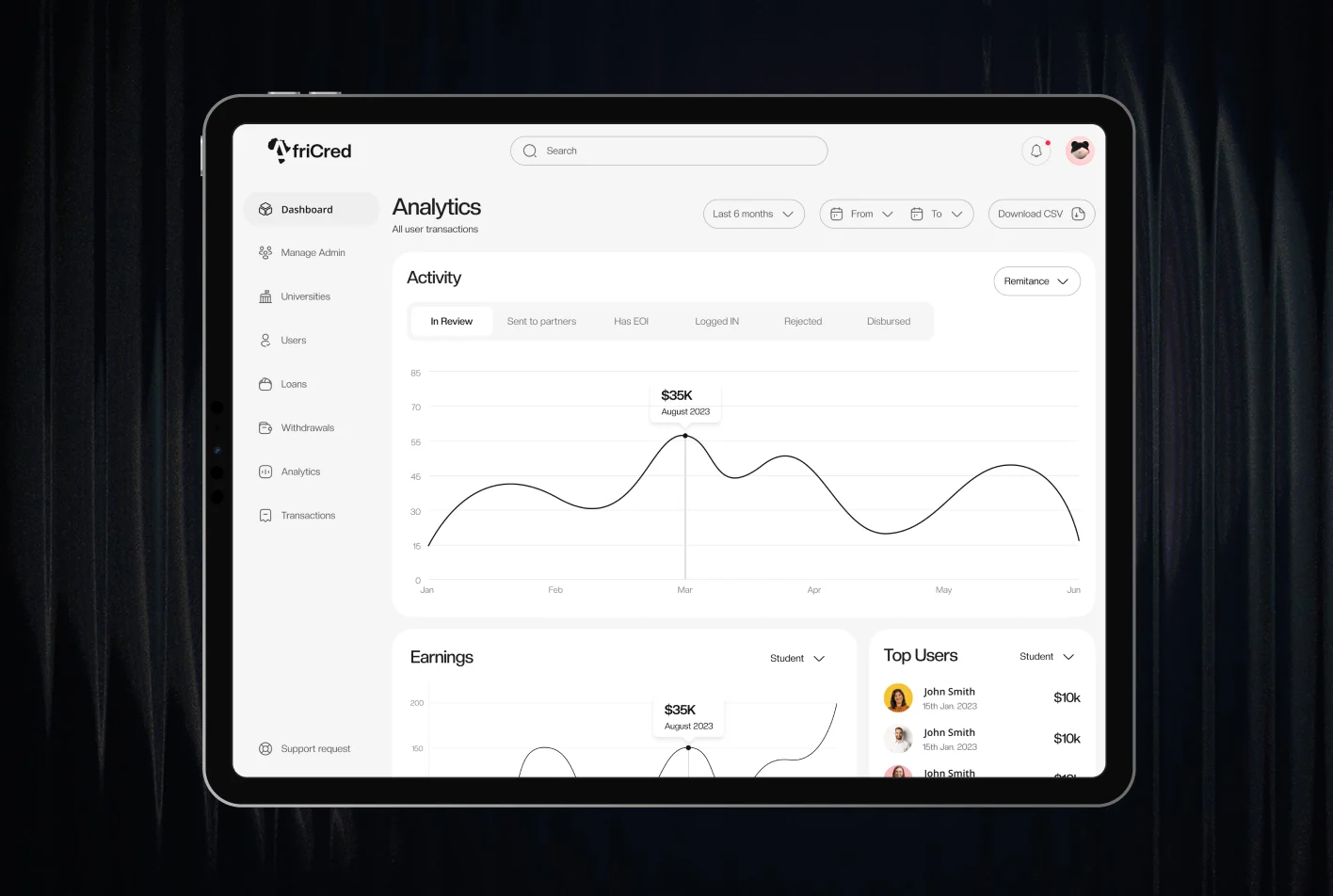
The console that took approval from weeks to days.
Delivery
We worked with the engineers every day until launch
Weekly design and development syncs managed scope and feasibility, and daily standups unblocked engineers with clear design intent. Design QA sessions checked UI integrity and responsiveness, and a lightweight design system handoff set the product up to scale.
Results
10,000+ users within six months of launch
Many of them were first-time borrowers applying on their own.
- $6M+ in student loans paid out, with admin-configured offers, clear repayment breakdowns and live progress tracking.
- 2,000 successful global admissions.
- 5 countries: Nigeria, Ghana, Kenya, South Africa and the United Arab Emirates.
What's next
AfriCred is now GlobCred
The early results validated the product and led to a usability revamp. AfriCred has since grown into GlobCred.
Building something like AfriCred? Let's talk about it.
Start a project
Tell us what you're building. A few lines is enough.
We'll read them, ask what we need to know and suggest a sensible first step.