A Richoco project · Creative agency · Marketing and media
GRAVO
A brand identity built on one idea, gravity.
The identity and brand guidelines for a Nigerian creative and advertising agency.
- GRAVO
- Creative agency · Marketing and media
- Brand identity, Logo system, Colour and type system, Art direction, Brand guidelines
The brief
A creative agency needed a brand with weight
GRAVO is a Nigerian full-service creative, marketing, media and advertising agency. It exists for businesses with good products that few people know about, and its job is to close the gap between a good business and a known one.
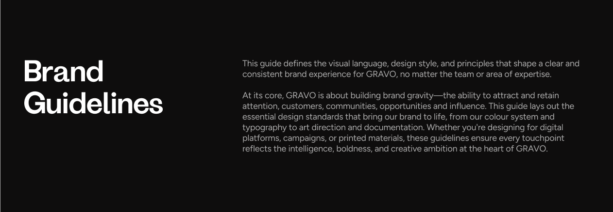
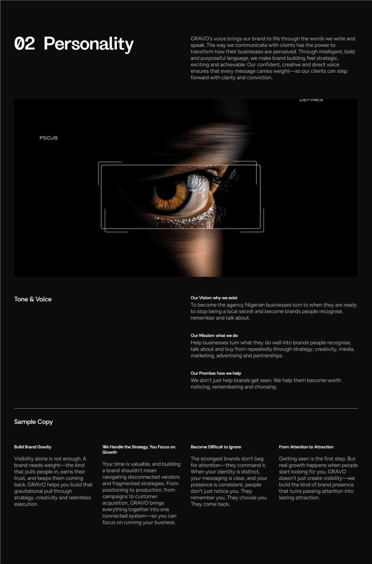
We designed GRAVO's identity. Then we set the whole system out as a one-page guidelines site, so every designer, writer and supplier works from the same rules.
How do you draw gravity?
The idea
One idea runs through every element
Gravity is invisible, but you know it by what it does. It pulls things in and gives them weight. The guidelines call this brand gravity: the pull that attracts attention, customers and opportunities, and keeps them.
Every part of the identity answers to that idea. The mark pulls towards its centre, the gradients look like light bending around a mass, and the logo is meant to be bold without being loud.
Identity
A G and an R fused into an arrow, repeated into a ring
The mark fuses a G and an R into an arrow pointing up and to the right, for growth. The arrow repeats around a circle into a ten-part ring, so everything pulls towards the centre. It is drawn as an outline stroke, and the wordmark is a heavy grotesk.
We documented the lockups, the construction and the clearspace. Six rules cover incorrect use, so the mark holds up from a pitch deck to a billboard.
Colour
Colour that reads as light bending around a mass
The palette has six colours: lime, periwinkle, dark olive, off-white, khaki and near-black. Two gradients start from a flat lime or periwinkle base, with a radial glow and two blurred shapes on top. Together they make the field look like it bends towards the mark.
Typography
Two typefaces and a four-step scale
Dx Grafik sets headlines, presentations and campaigns. Instrument Sans sets body copy, reports and supporting content. The scale runs in four steps, from hero headlines above 72px to body text under 24px, each with its own leading and tracking.
Art direction
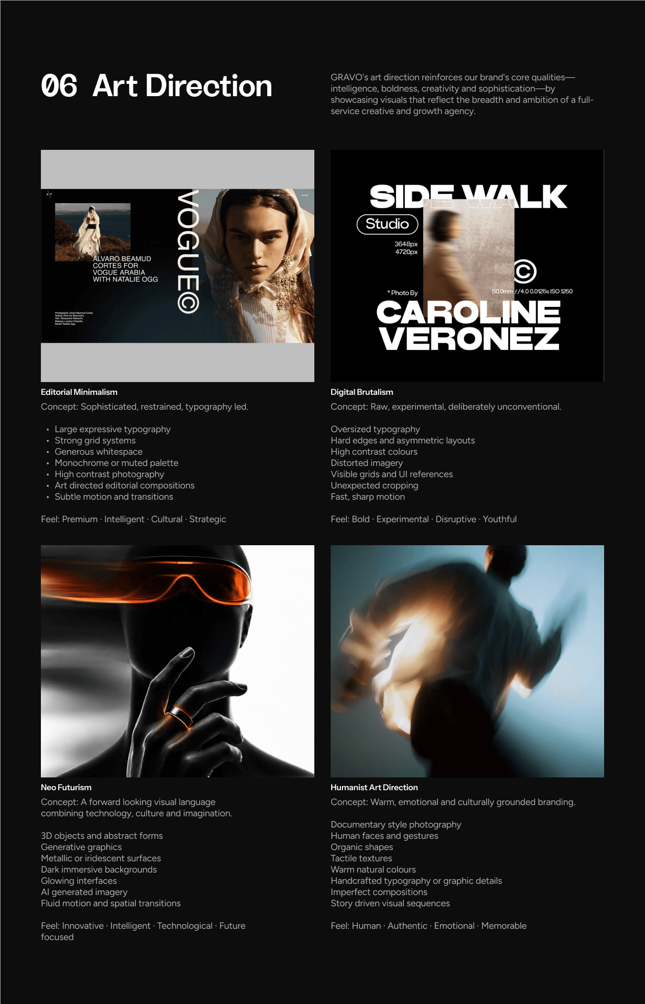
Four art directions for a full-service agency
GRAVO works across campaigns, media, strategy and production. One visual style would not cover it. The guidelines define four directions, each with its concept, traits and feel: editorial minimalism, digital brutalism, neo futurism and a humanist direction.
Delivery
The whole system on one page
The guidelines are one page in six chapters: strategy, personality, logo, colour, typography and art direction. A side navigation keeps every chapter one click away.

Building something like GRAVO? Let's talk about it.
Start a project
Tell us what you're building. A few lines is enough.
We'll read them, ask what we need to know and suggest a sensible first step.