A Richoco project · Marketplace · Consumer web
Tino
A classifieds marketplace for Nigeria, designed around trust.
Brand, product strategy and platform design for a classifieds marketplace, from the first wireframe to MVP.
- Tino
- Marketplace · Consumer web
- Product strategy, UX research, Brand identity, Platform design, Design system, Design QA
- 4 months to MVP, with ongoing iterations
- The founder as product owner, 2 developers (frontend and backend), 1 QA analyst, and later a content and community manager
- MVP built, not yet launched
The brief
Everyday deals online were complicated by scams
In Nigeria, buying a used phone, hiring someone local or selling household goods online often means dealing with scams, inefficiency and platforms people don't trust.
Tino set out to fix that: a classifieds platform with the familiarity of a local market and the safety of modern UX. We led it from the first wireframe. We defined the product scope and user goals with the founder, ran the research and market analysis, created the brand, designed the web platform responsive from day one, and worked with engineering through agile sprints to design QA.
The problem
Existing marketplaces were crowded and hard to trust
- People didn't trust peer-to-peer selling.
- Search and discovery were weak.
- Feeds were overloaded, with fake listings among them.
- Posting an ad or contacting a seller was confusing.
- There was no structured space for local talent or jobs.
How do you put the trust of a face-to-face market deal online?
Goals
We set out to build a web app that feels Nigerian, trustworthy and simple
- Make it easy to become a vendor, post, browse, buy and sell.
- Show verified users and profiles clearly, for safety.
- Organise categories well and give search proper filters.
- Add a Talent Pool and Job Listings for freelancers and small businesses.
Research
We listened to sellers before we drew a screen
We interviewed, in person and remotely:
- 12 informal sellers of phones, electronics, fashion and more
- 5 freelancers offering local services
- 8 regular users of classifieds apps
- Local agents who use the platforms for promotion
What we heard:
- Trust came first. Fake ads, ghost buyers and scams were common.
- People wanted clear prices, visible contact details and verification badges.
- Posting an ad on other platforms was long and confusing.
- Mobile users needed light flows that work on unstable connections.
Key decisions
Trust first, contact made easy, flows kept short
- 01
WhatsApp before in-app chat
Buyers wanted visible contact details, and sellers already did business on WhatsApp.
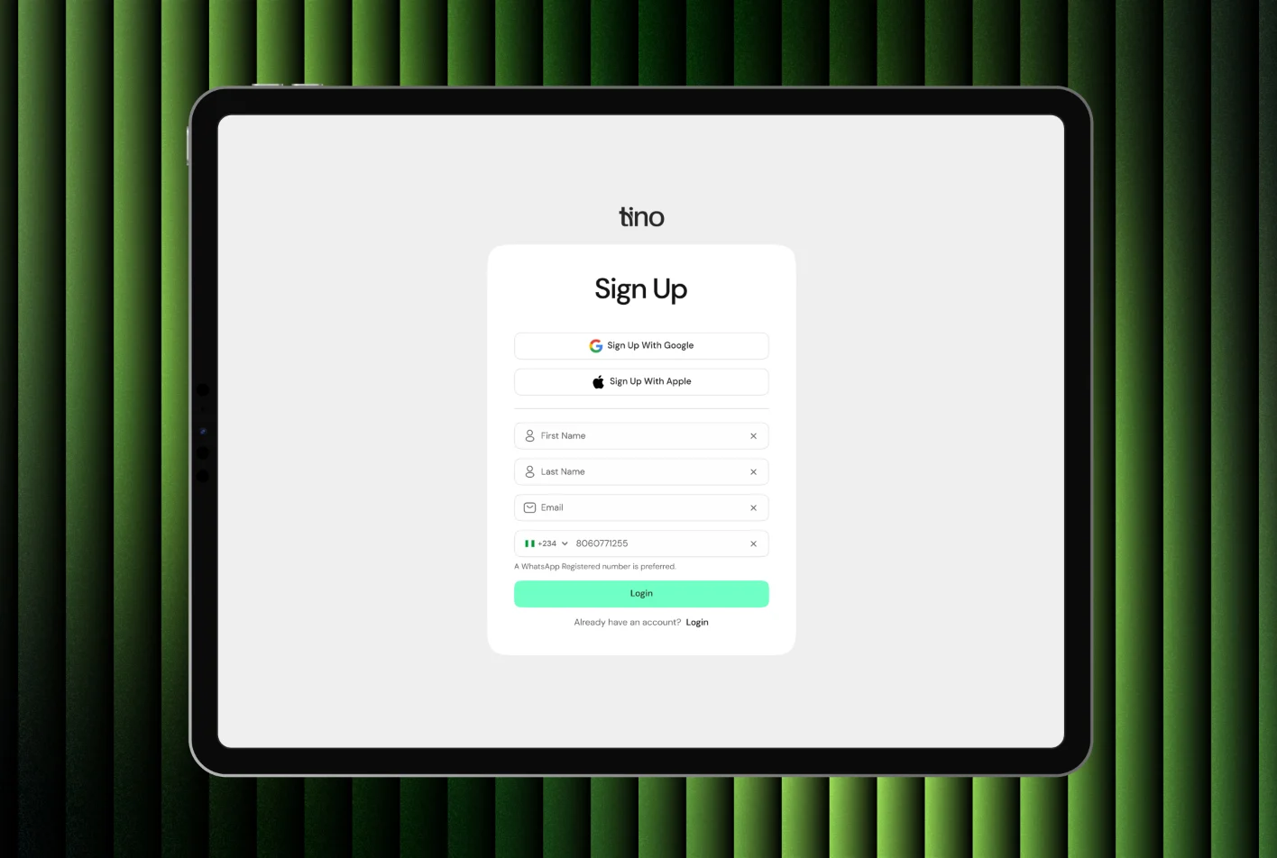
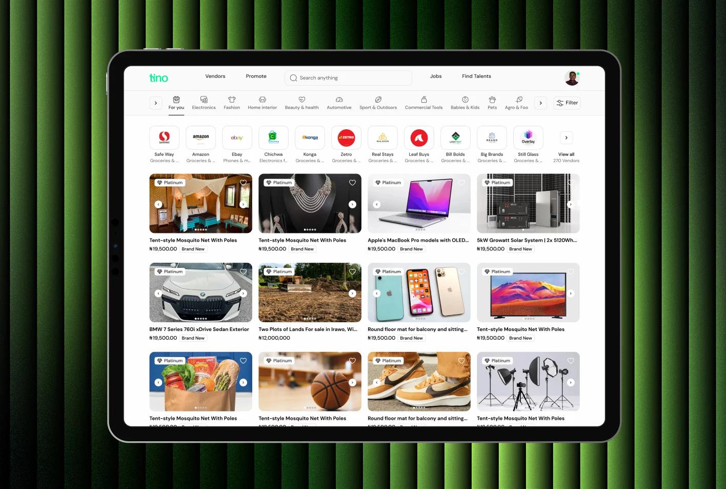
Every listing and store leads with "WhatsApp Me" and "Reveal Contact", and sign-up asks for a WhatsApp-registered number, so buyers reach sellers on the channel they already use.
- 02
Trust signals on every listing
Fake ads, ghost buyers and scams were common on existing platforms.
"Identity verified" on stores and verified badges, freshness tags like "posted 1 hour ago" meant to draw buyers to new ads, and safety tips on every listing.
- 03
Ad posting in short steps
Posting an ad on other platforms was long and confusing.
Four short steps (category, media and details, preview, post) instead of one long form.
In prototype demos, users understood the posting flow with little onboarding friction.
- 04
Talent and jobs inside a classifieds app
There was nowhere structured for local talent or jobs.
A Talent Pool and Job Listings, designed as mirror pages so one system serves both sides of the market.
Internal reviewers picked it out as what sets Tino apart from typical classifieds apps.
The hard part
The risk was in the gaps between Tino's products
Tino is several products on one platform: buyers, vendors, job seekers, employers and the admins behind them, each with their own flows and modules. The work was keeping every module whole, so nothing slipped through the gaps between segments.
One gap nearly did. Tino Quickie promotes a single ad, while monthly plans cover all of a vendor's ads. Early on, every promotion started from the subscription page, so a vendor could pay for a Quickie without choosing which ad it was for. The payment flow and the listing flow each worked on their own; the handoff between them didn't.
We caught it walking the flows end to end with the team. Now a single-ad promotion starts from the ad itself: a "Promote" action on each row of the ads table carries that ad into payment with the Quickie already selected. The plans page stays the way in for monthly plans.
Architecture
Three ways to use Tino
Chinaza, the research persona we designed around, is 27, from Imo, and a freelance fashion designer who sells locally without a middleman. Chinaza prefers WhatsApp and Instagram, on an Android phone with limited storage and unstable internet.
Brand
Local, honest and reliable, from the name up
- Logo: simple, rounded type for approachability, with a curve joining the t and the i.
- Colour: deep green and warm orange, for trust with some energy.
- Type: DM Sans, friendly and professional, easy to read on a phone.
- Tone: a clean interface with warm, familiar icons.
Design system
A design system built for mobile browsers on patchy data
- Short, step-by-step ad posting.
- In-platform messaging with spam detection and quick replies.
- Freshness indicators like "posted today" and "verified user".
- Category tags and badges for matching jobs and talent.
- Filters that change by category: price, location, skills.
- Modular listing cards, seller profile modules, upload and validation states, and vendor and super-admin dashboards.
- Every page responsive from the start, for heavy use on mobile browsers in data-sensitive regions.
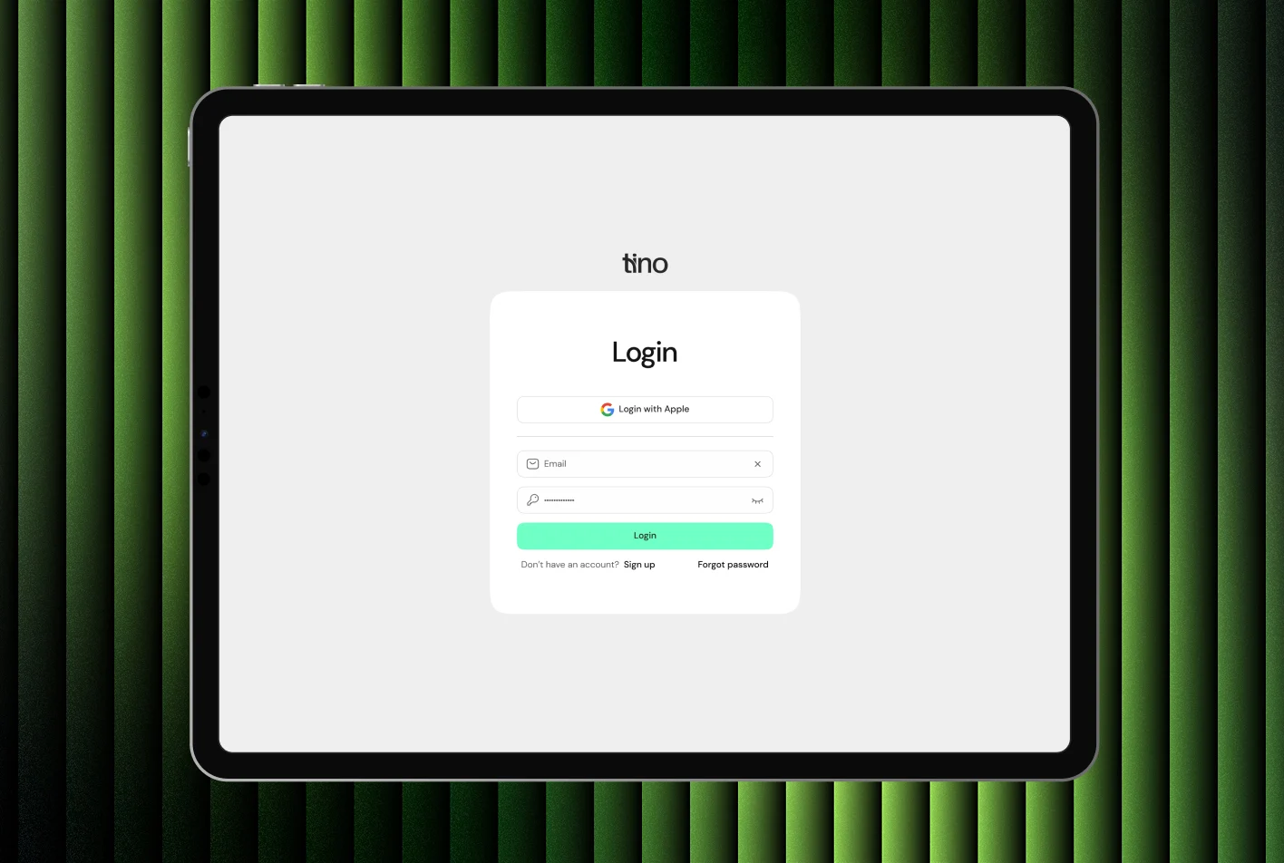
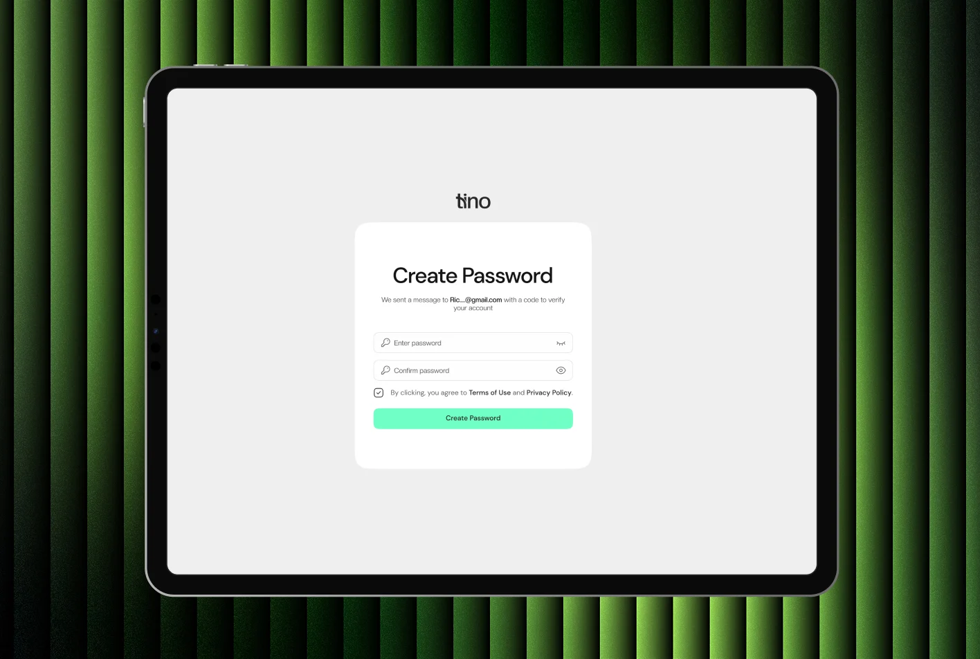
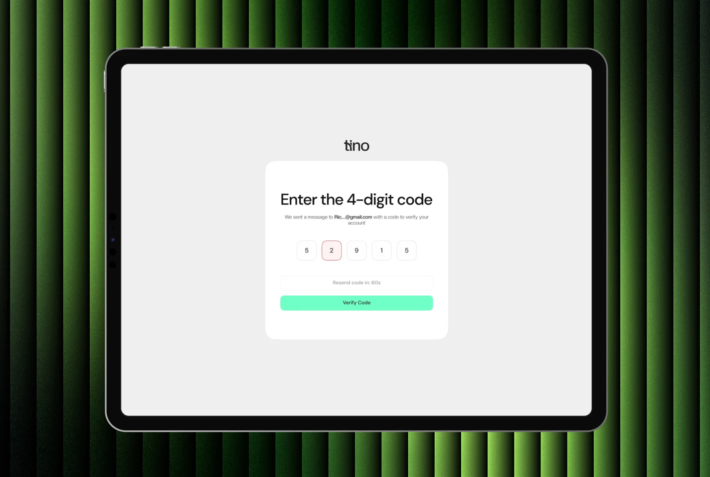
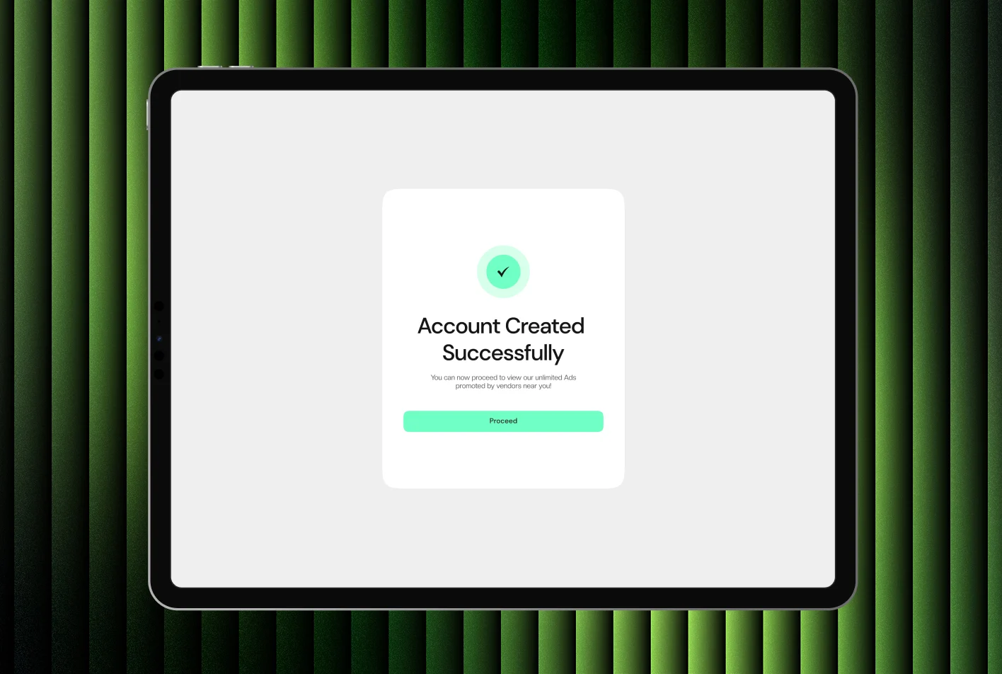
Sign up and verification
From the feed to a listing
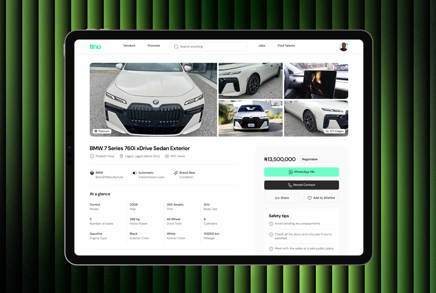
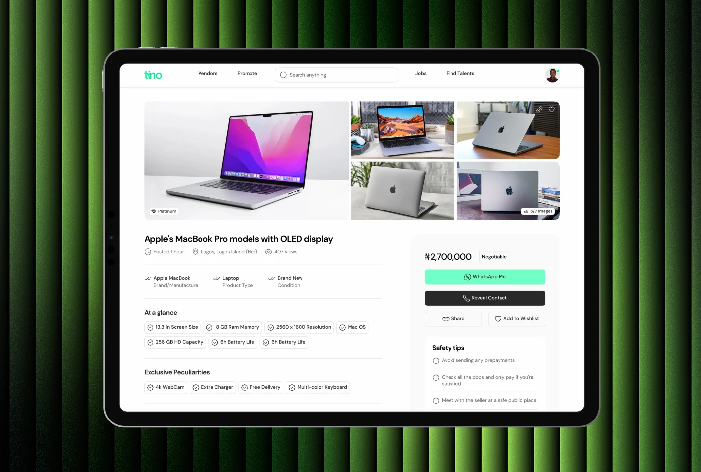
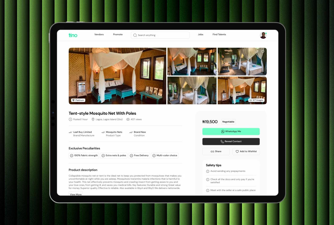
Stores, reviews and promotion
Jobs and talent: one page, two sides of the market
The back office
Vendors can manage listings, track buyer enquiries and monitor reviews in one dashboard, designed to get first-time vendors from sign-up to their first sale.
Delivery
Design sprints with the founder set the MVP scope
Weekly alignment with engineers kept implementation moving. Design QA with the frontend developers checked visual and functional fidelity, and handoff docs prepared the ground for future mobile builds.
Results
Early signals
Tino's MVP is built and hasn't launched yet, so these are signals from the build, not market results.
- MVP features were implemented ahead of the sprint timeline, helped by detailed user flows and dev-ready documentation.
- Design, development and product stayed closely aligned around a clear, modular design system.
- Stakeholders responded well to the usability and clarity in walkthroughs and internal QA.
- In prototype demos, people understood ad posting, talent sign-up and buyer messaging with little onboarding friction.
- Stakeholders saw the local tone, light feel and simple navigation as key to fitting data-sensitive regions.
Building something like Tino? Let's talk about it.
Start a project
Tell us what you're building. A few lines is enough.
We'll read them, ask what we need to know and suggest a sensible first step.