A Richoco project · EdTech · Multi-panel dashboards
Univacity Web
A desktop platform for the work the mobile app couldn't hold.
Multi-panel dashboards for students and recruiters, built on the Univacity app redesign.
- Univacity
- EdTech · Multi-panel dashboards
- UX research, UX strategy, Product design, Design system, Design-to-code
- 7 months, discovery to V1 web platform launch
- 1 product manager and business analyst, 3 engineers (frontend web and backend API), 1 QA engineer, 2 customer support leads
- 34%
- fewer support tickets during beta testing
The brief
The app was cohesive. The website was still a brochure.
After our redesign of the Univacity app, the web experience was the weak link: fragmented, outdated and disconnected from mobile. Yet desktop carried 62% of recruiter activity and 38% of student research sessions. It ran on legacy templates that couldn't support what Univacity was adding: scholarship management, real-time document tracking and recruiter dashboards.
It needed a ground-up rebuild designed for what large screens do well: multitasking, side-by-side work and dense data.
We led the end-to-end UX strategy and product design:
- The responsive strategy from 1280px to 1920px+, for students, recruiters and institutional partners.
- Discovery, and remote usability testing with 24 participants across 4 countries.
- Information architecture and multi-panel layouts.
- More than 90 high-fidelity screens.
- A shared Figma-to-code design system, built with the frontend engineers.
The problem
The legacy site worked against Univacity's mission
- Pages broke below 1440px, shutting out the smaller laptops and tablets common in African university libraries and co-working spaces.
- Scholarships, visa support, flights and hostels lived on separate pages with no shared navigation.
- Recruiters ran their applicant pipelines in spreadsheets and email threads, because the dashboard had no filtering, status tracking or batch document review.
- Every visitor saw the same homepage, whatever their role, intent or progress.
- Trust signals were missing: verified badges, transparent pricing and live application status.
Research
Two findings set the direction
73% homepage bounce rate. Sessions on the legacy site averaged 1 minute 42 seconds. People couldn't find their way in, or didn't trust the platform enough to stay.
- Response: role-based landing. Students see programme recommendations and their application status first; recruiters land on their pipeline, with metrics and pending reviews up front.
Recruiters compare 15+ applicants at once. They review documents side by side and update statuses in bulk, work that is cramped on a phone and natural on a desktop.
- Response: a split-view recruiter dashboard with side-by-side document review, bulk actions and filters that stay put. It was designed to cut average pipeline management from 45 minutes to under 12 per session.
Principles
Six principles, from 24 user sessions and the analytics
- Spatial hierarchy over linear scrolling
- Services surfaced in context
- A dashboard-first recruiter experience
- Complexity revealed step by step for students
- Design tokens shared across platforms
- Accessibility-first responsive architecture
Key decisions
A 12-column grid, built from 1280px up
- A 12-column grid from 1280px to 1920px+, with deliberate breakpoints at 1440px and 1680px.
- A persistent sidebar, contextual breadcrumbs and role-based default views for students and recruiters.
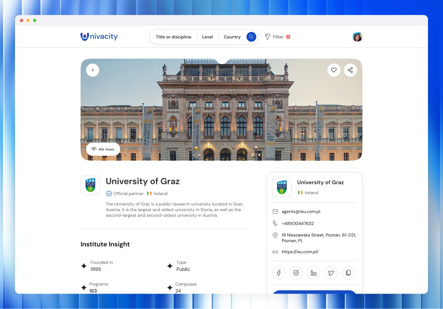
- Trust built into the layout: verified institution badges, live status bars, transparent pricing and live-chat support.
- Every UI element mapped to a shared design token, so mobile and web stay visually in step.
Tiered service packages with clear visual differences tell students at a glance how much support each plan includes. With persistent progress indicators and contextual tooltips, they cut support tickets by 34% during beta testing.
We designed wireframes for 7 core journeys, from student discovery and application to the recruiter pipeline and institutional onboarding. We built and tested 4 interactive prototypes: 2 unmoderated in Maze, and 2 moderated in person with recruiters. Then we ran 3 iteration cycles using heatmaps, task completion rates and feedback.
Design system
"The brighter Africans", at desktop scale
The visual language from the app, rebuilt for large screens: clear space, typographic hierarchy at scale, and dense layouts that still breathe. The colour system grew into semantic roles (status colours for pipelines, accents for features) and meets WCAG 2.1 AA contrast across every surface combination. The system holds 180+ reusable web components, and 64 design tokens shared with mobile.
Getting in
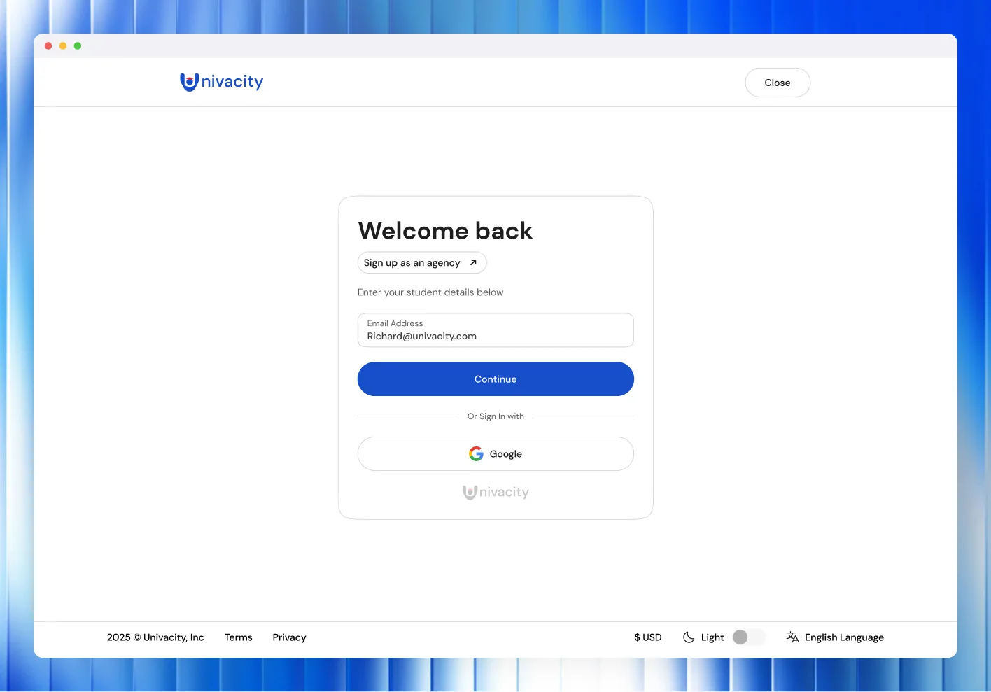
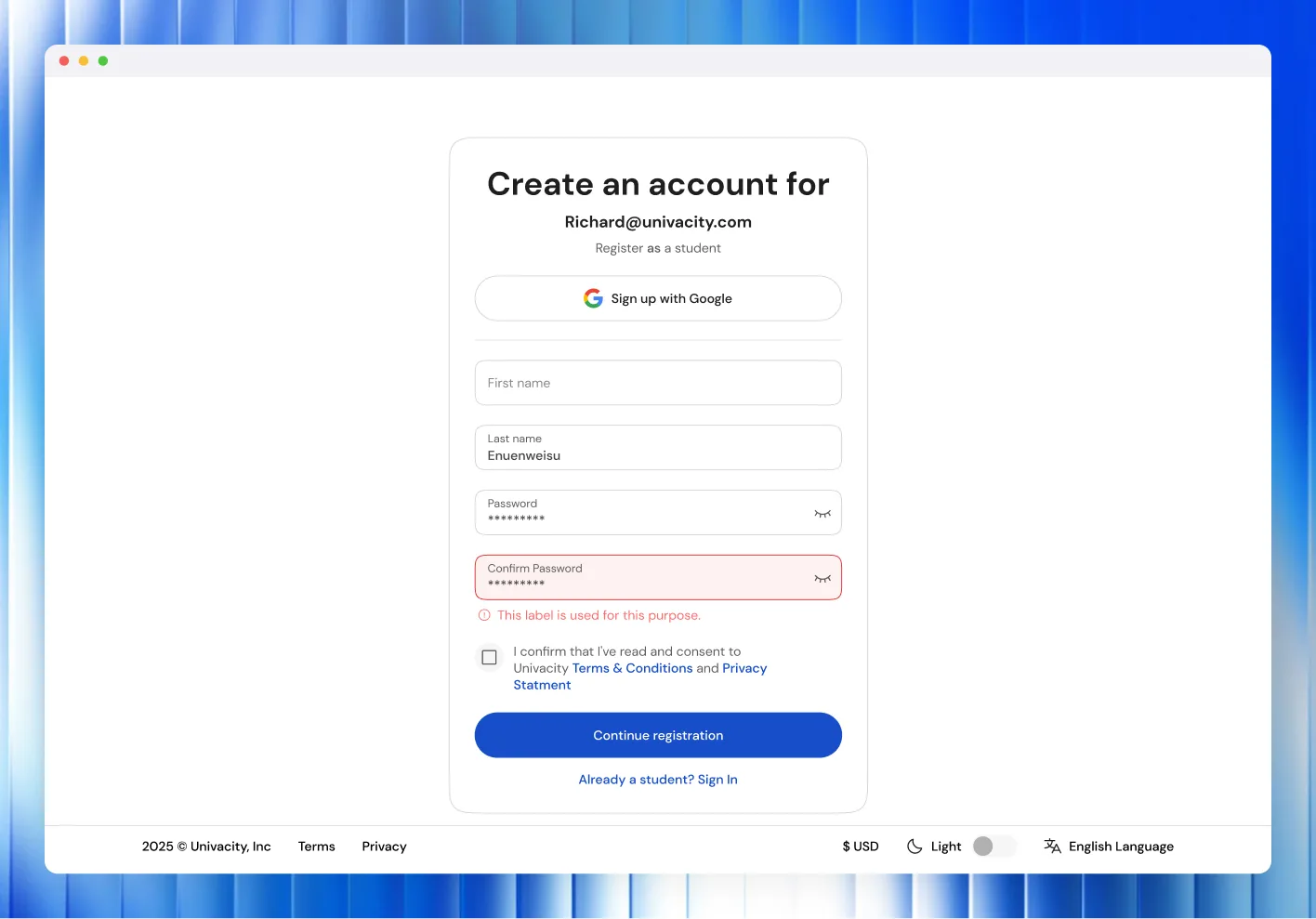
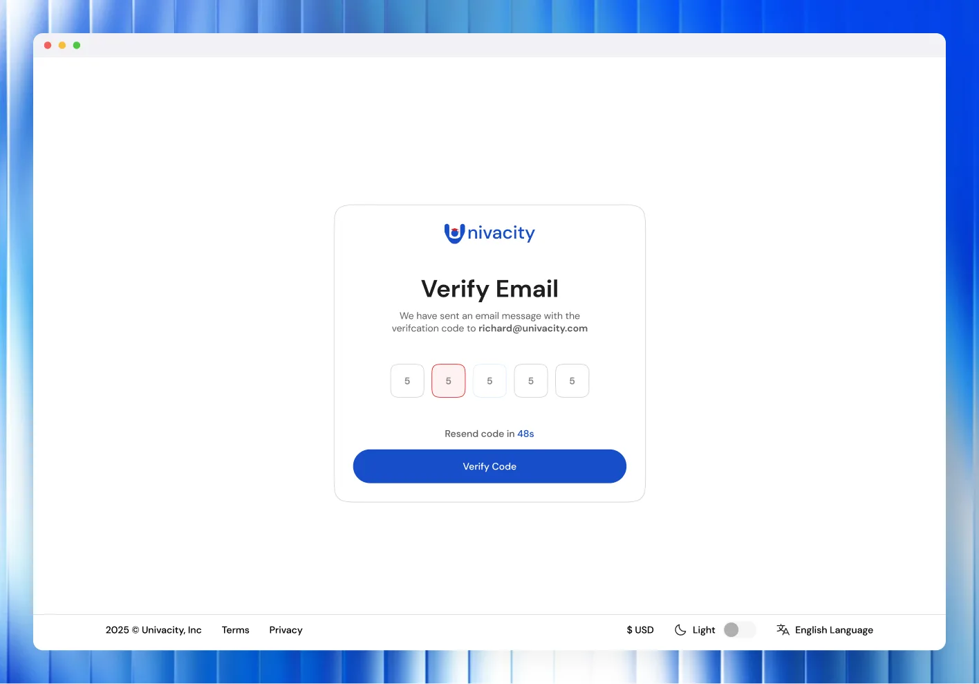
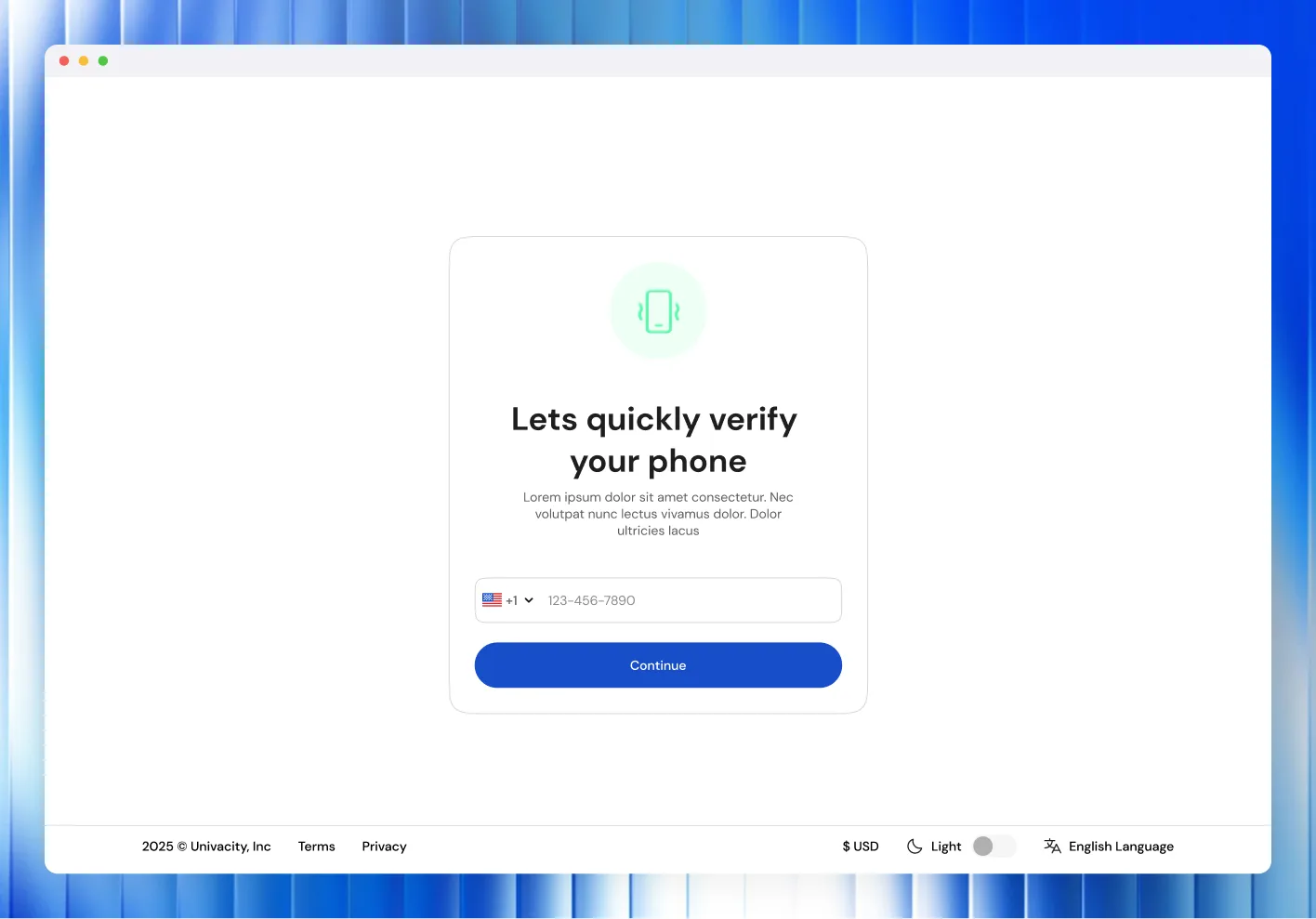
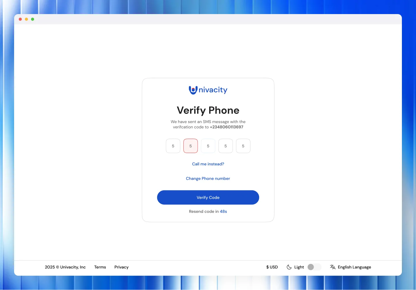
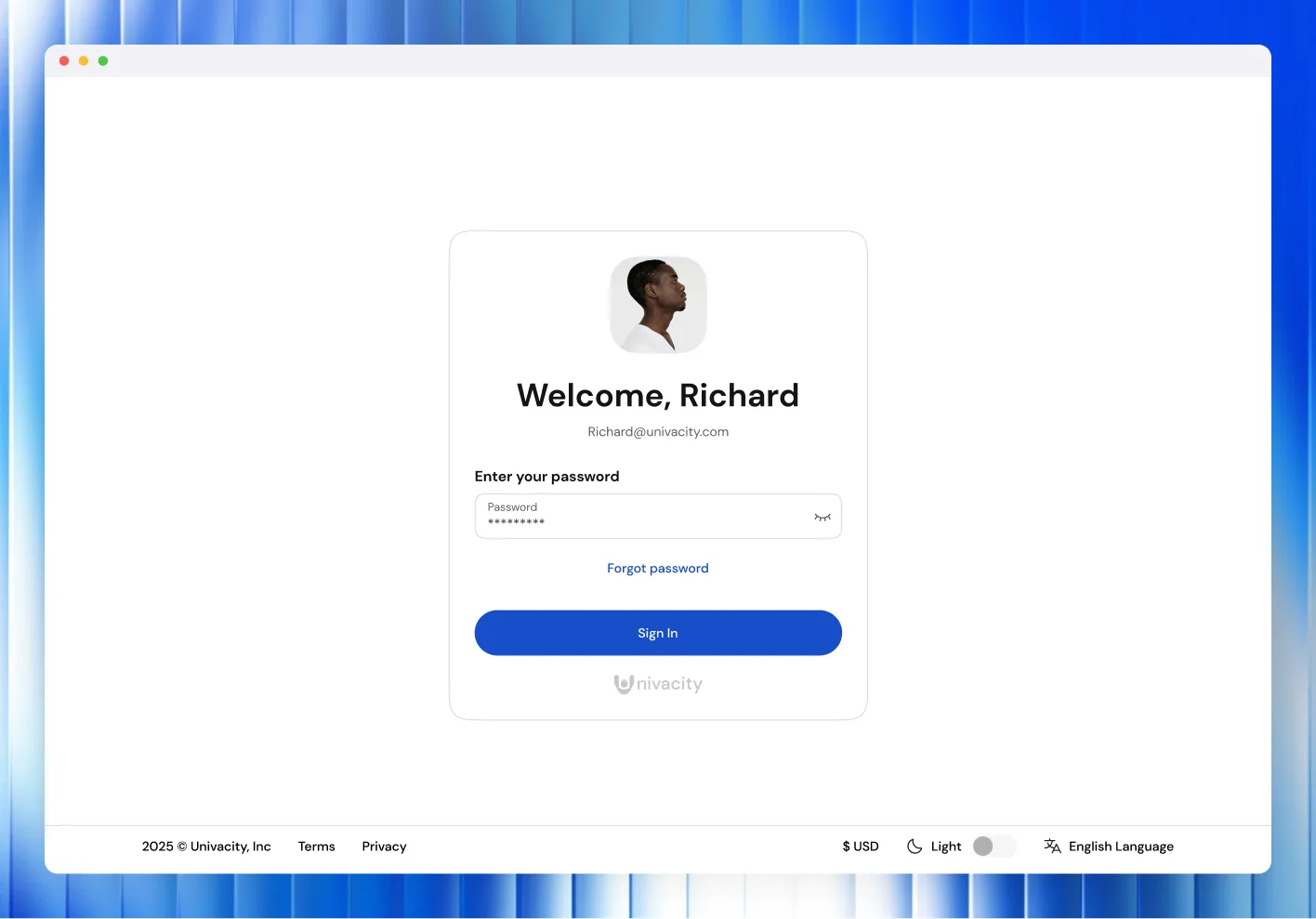
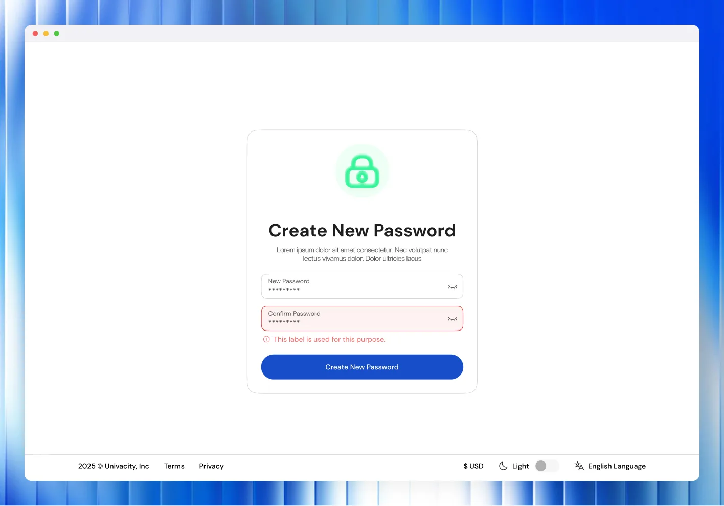
Application
One long application, broken into steps a student can finish
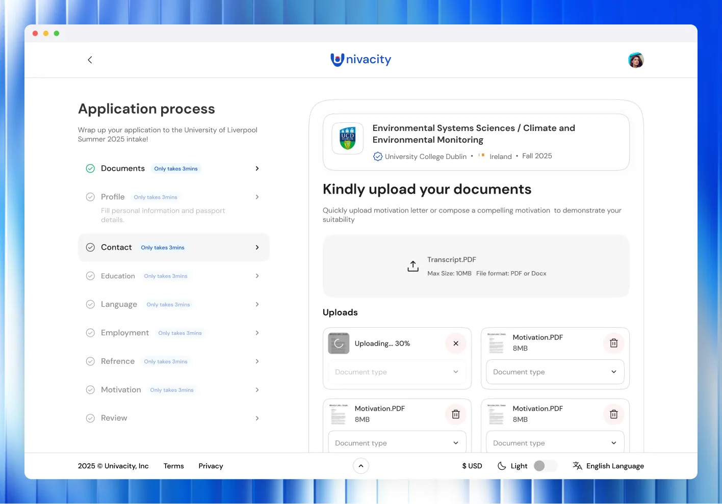
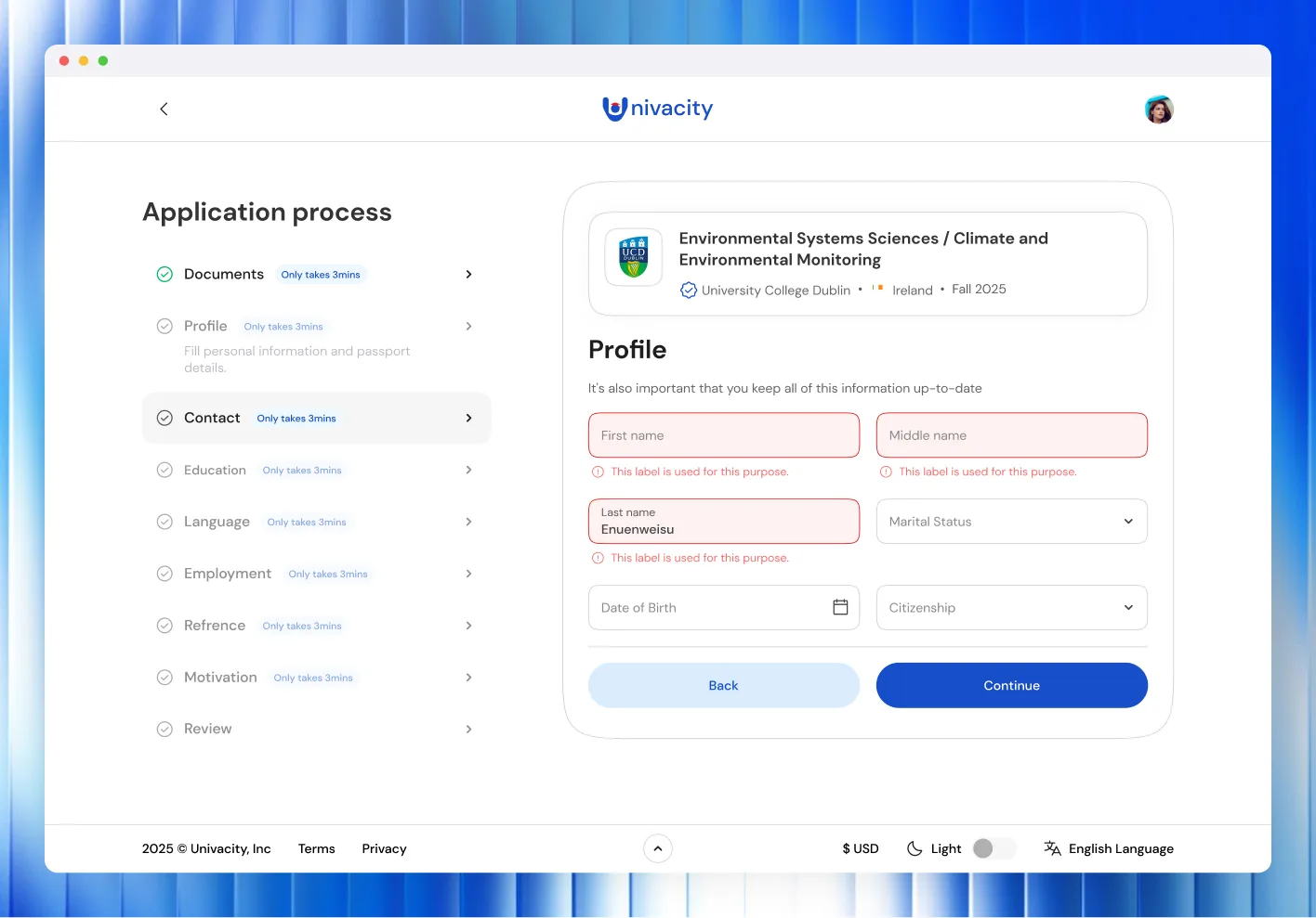
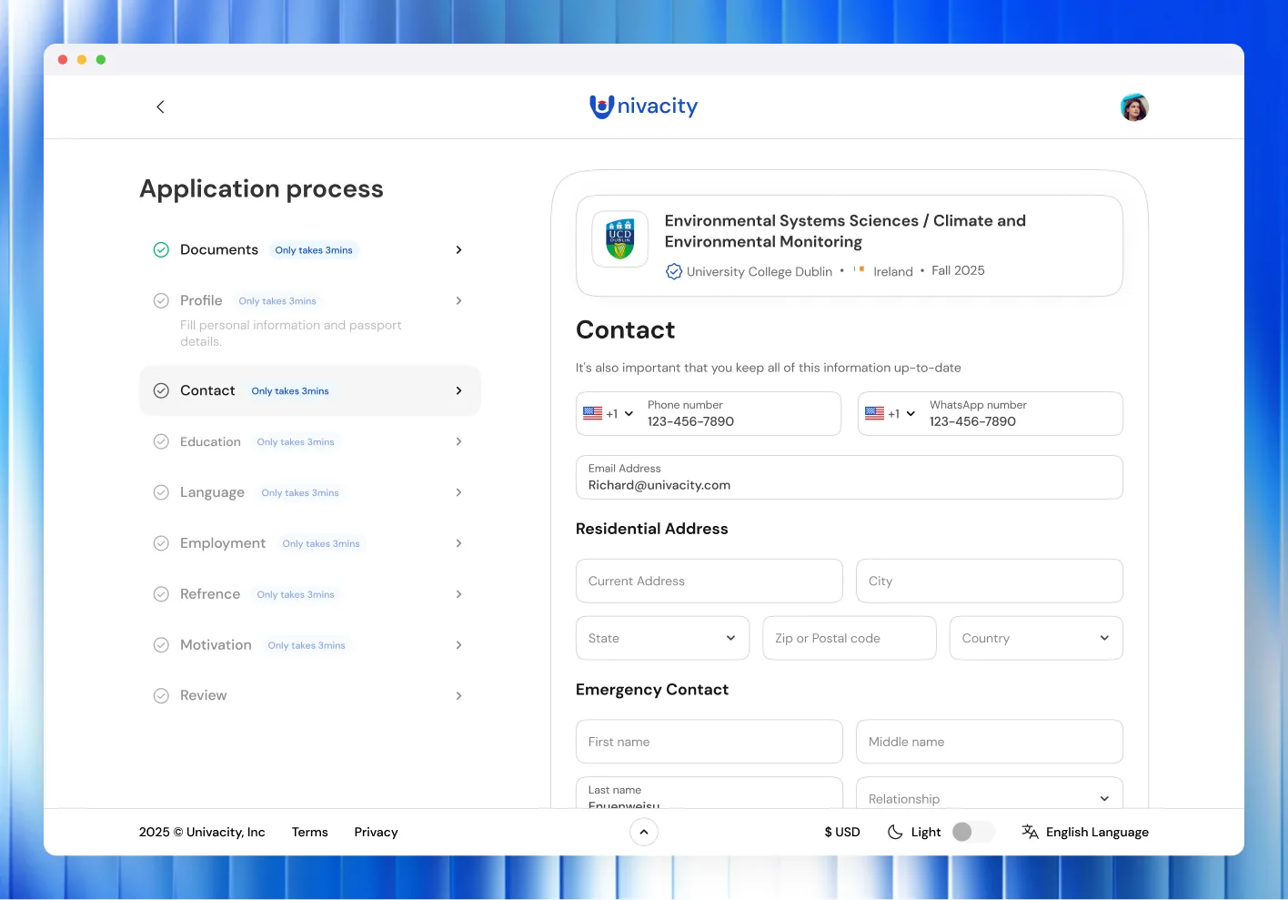
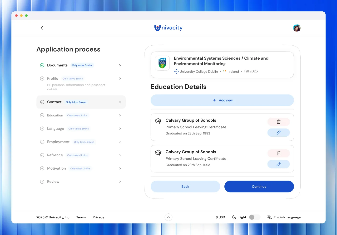
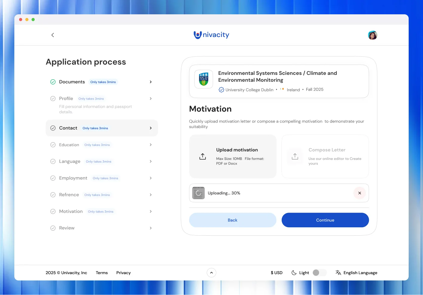
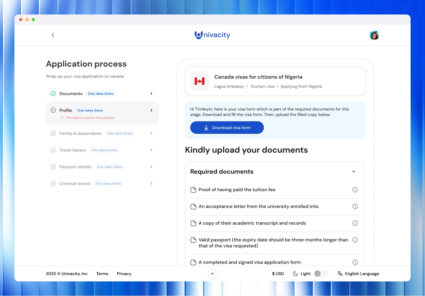
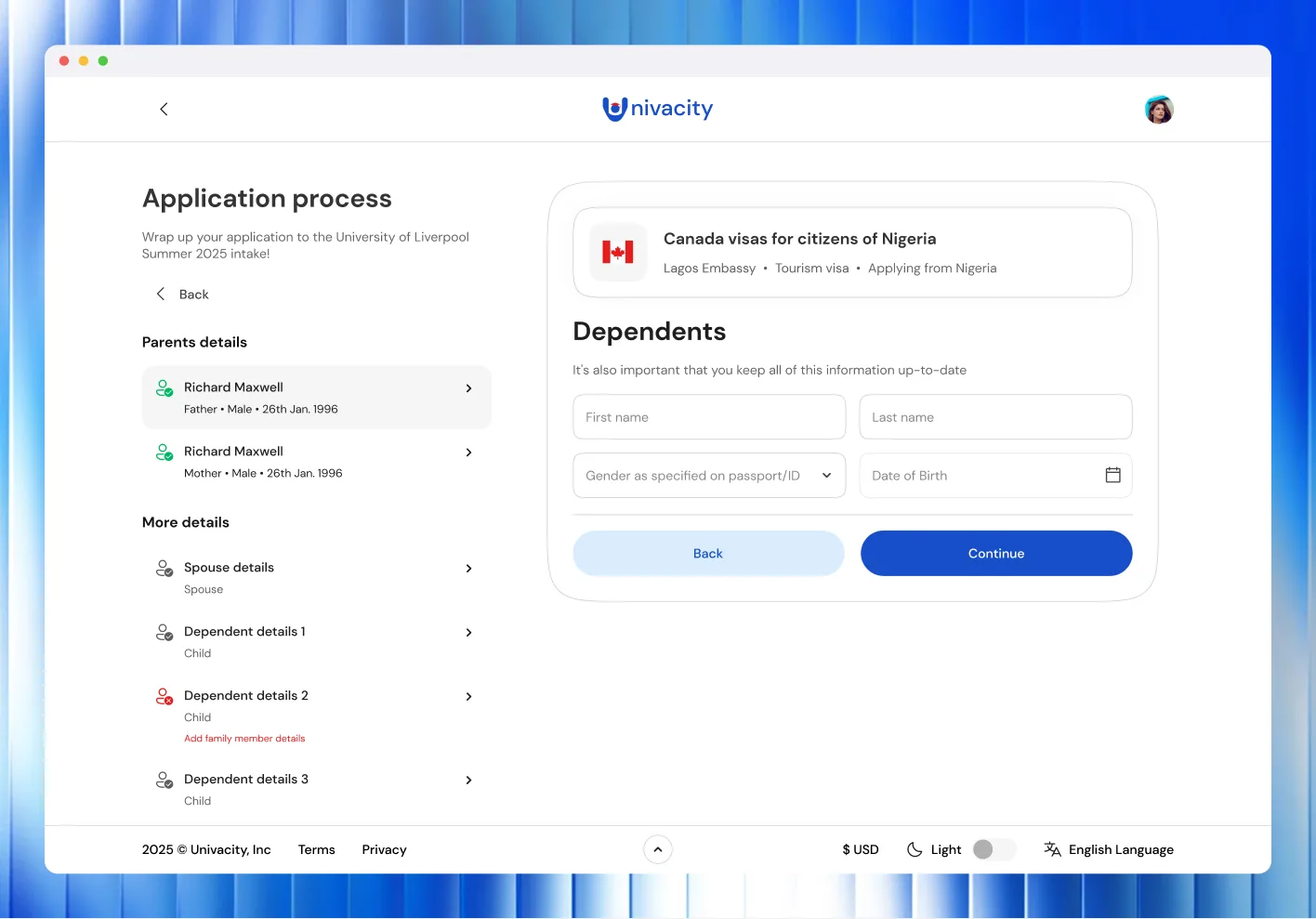
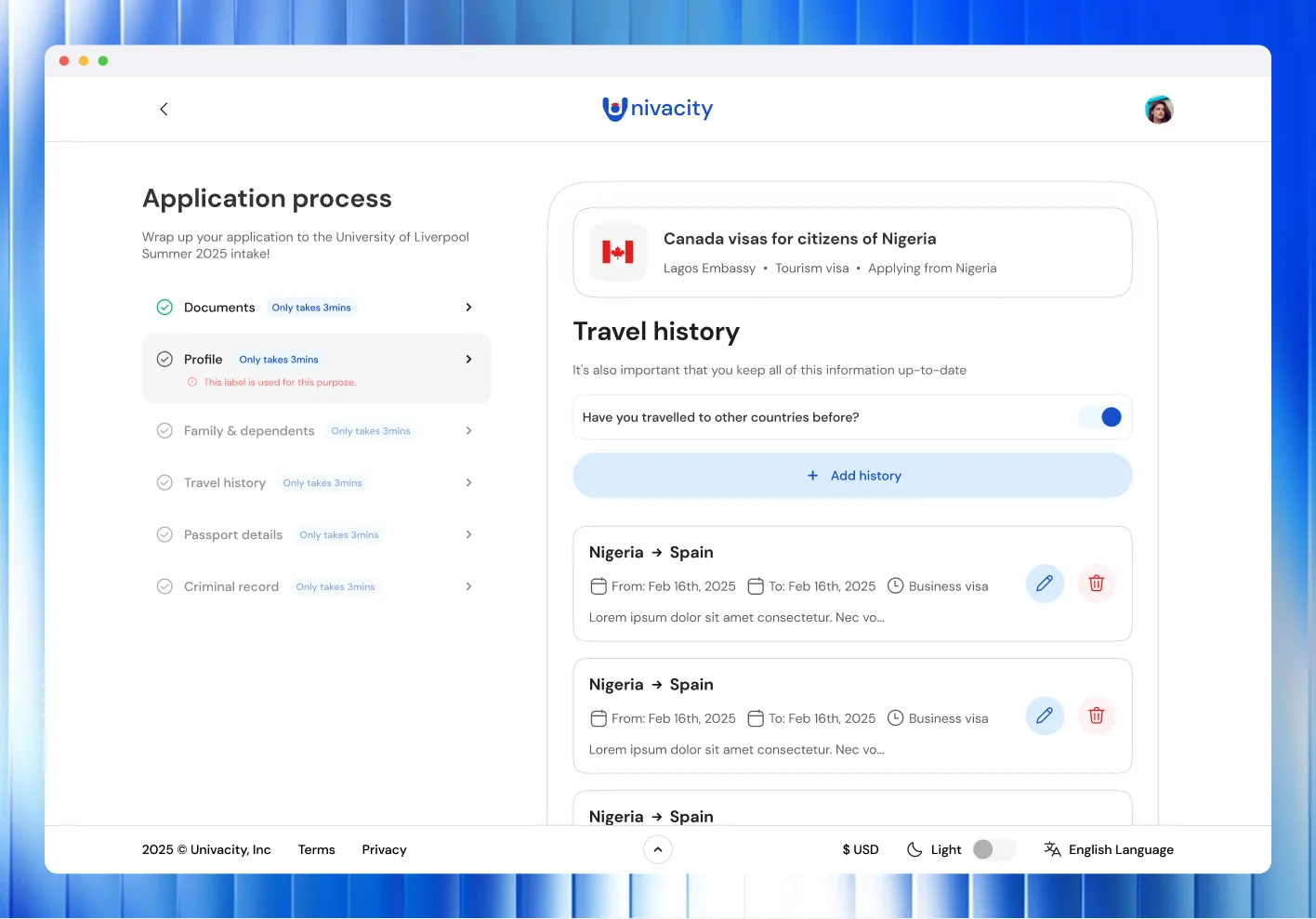
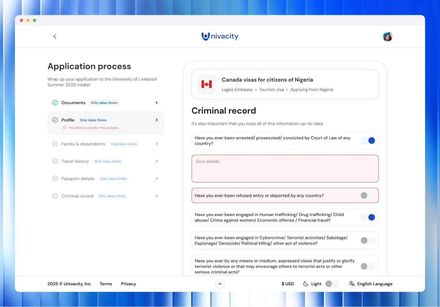
The admission application is the longest task on the platform. On the web it runs down a persistent left-hand rail: documents, profile, contact, education, language, employment, reference, motivation and review. Each step shows a time estimate and can be resumed, and the programme being applied to stays pinned above the form throughout.
Dashboards
Recruiters land on their pipeline. Students land on their progress.
The same platform, with two front doors.
Services
Every service behind one search bar
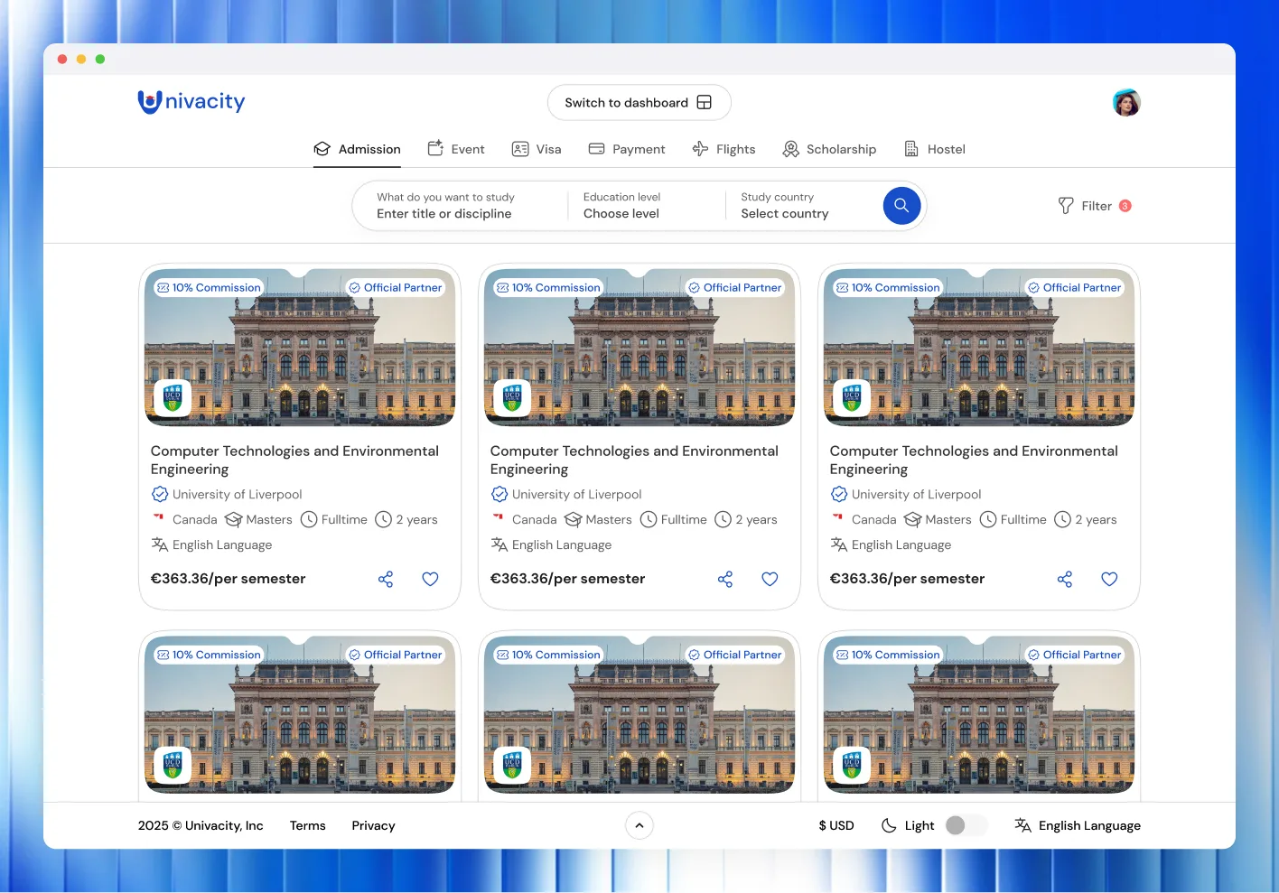
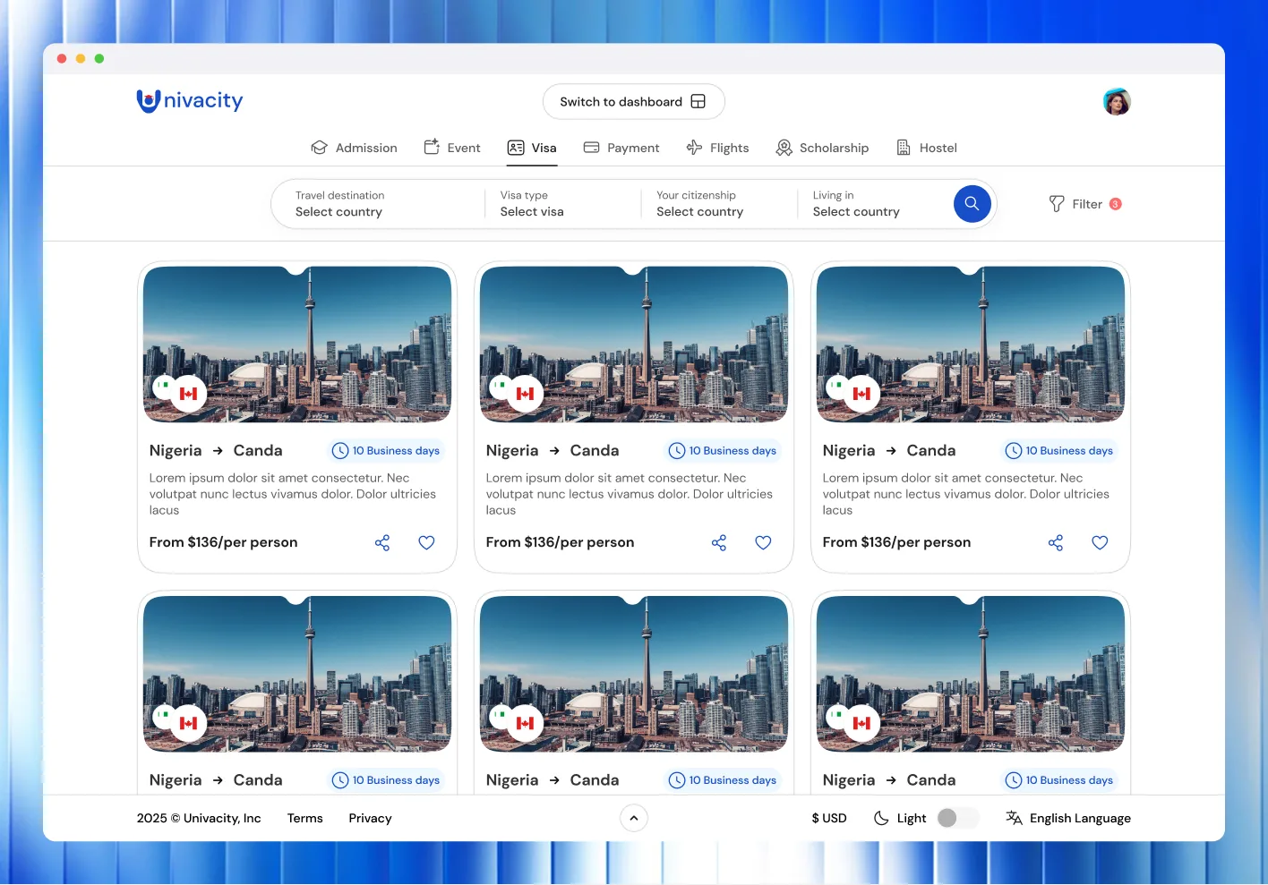
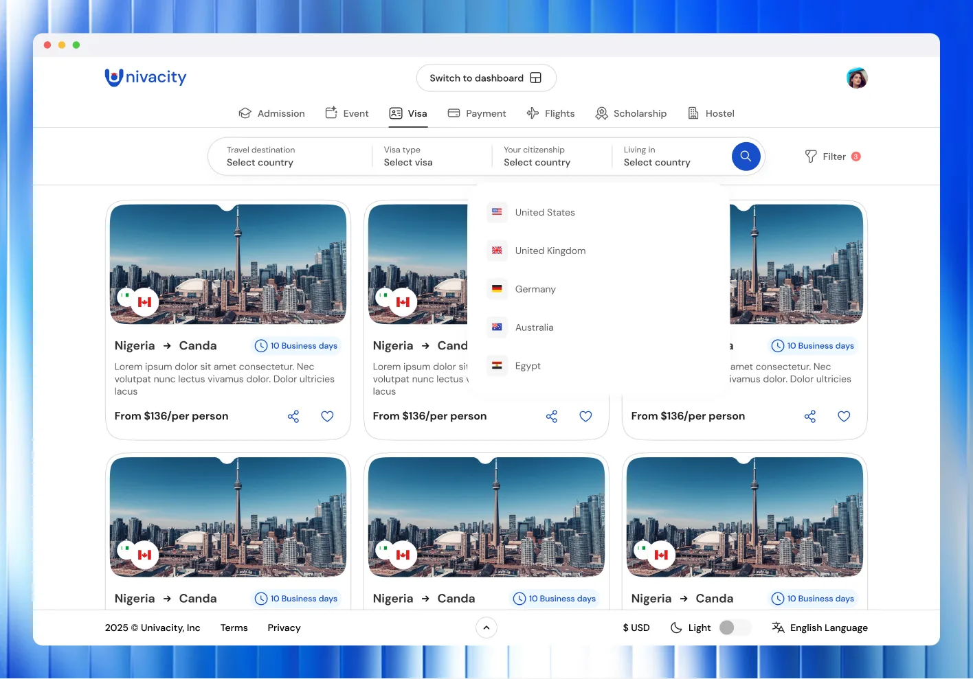
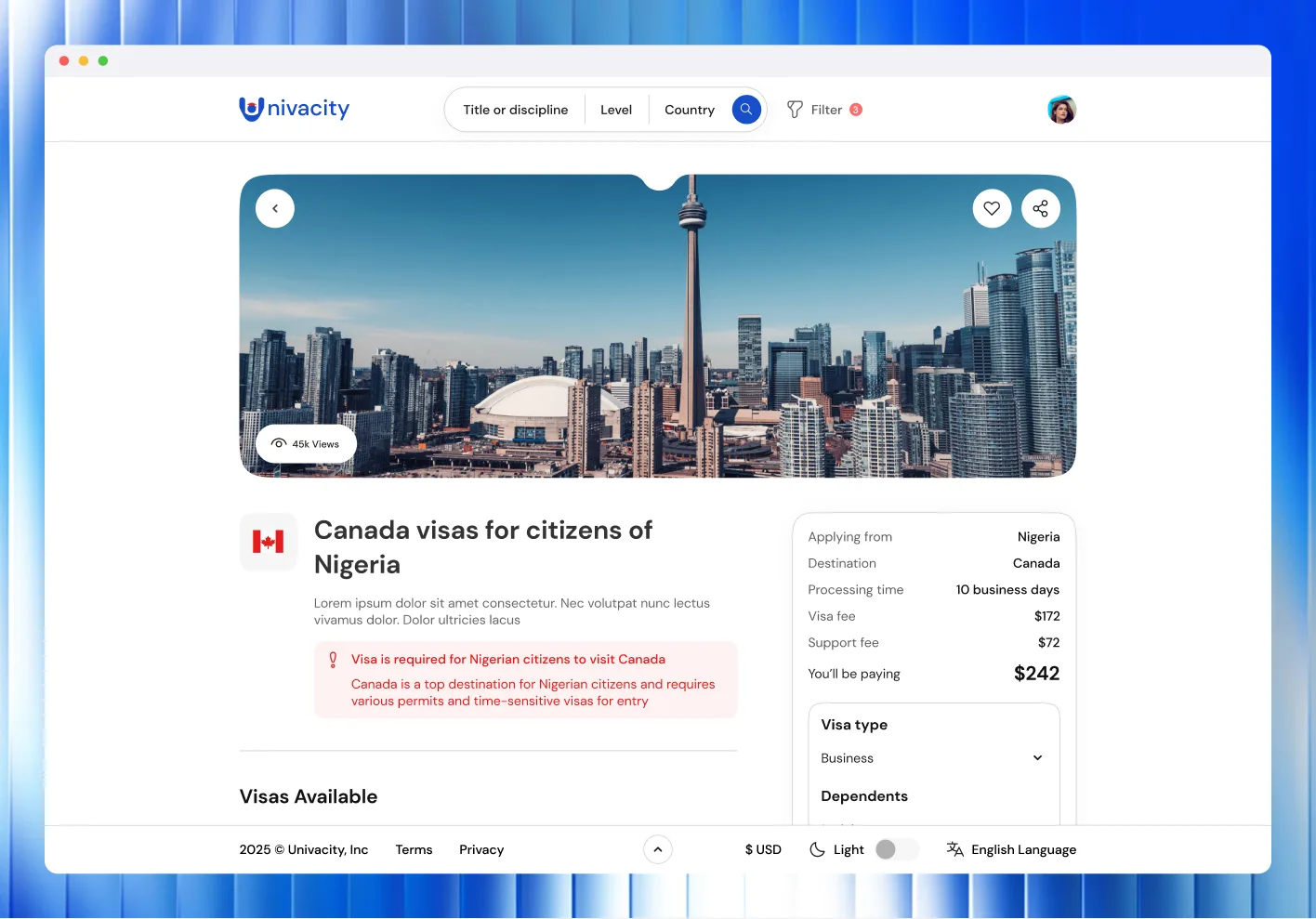
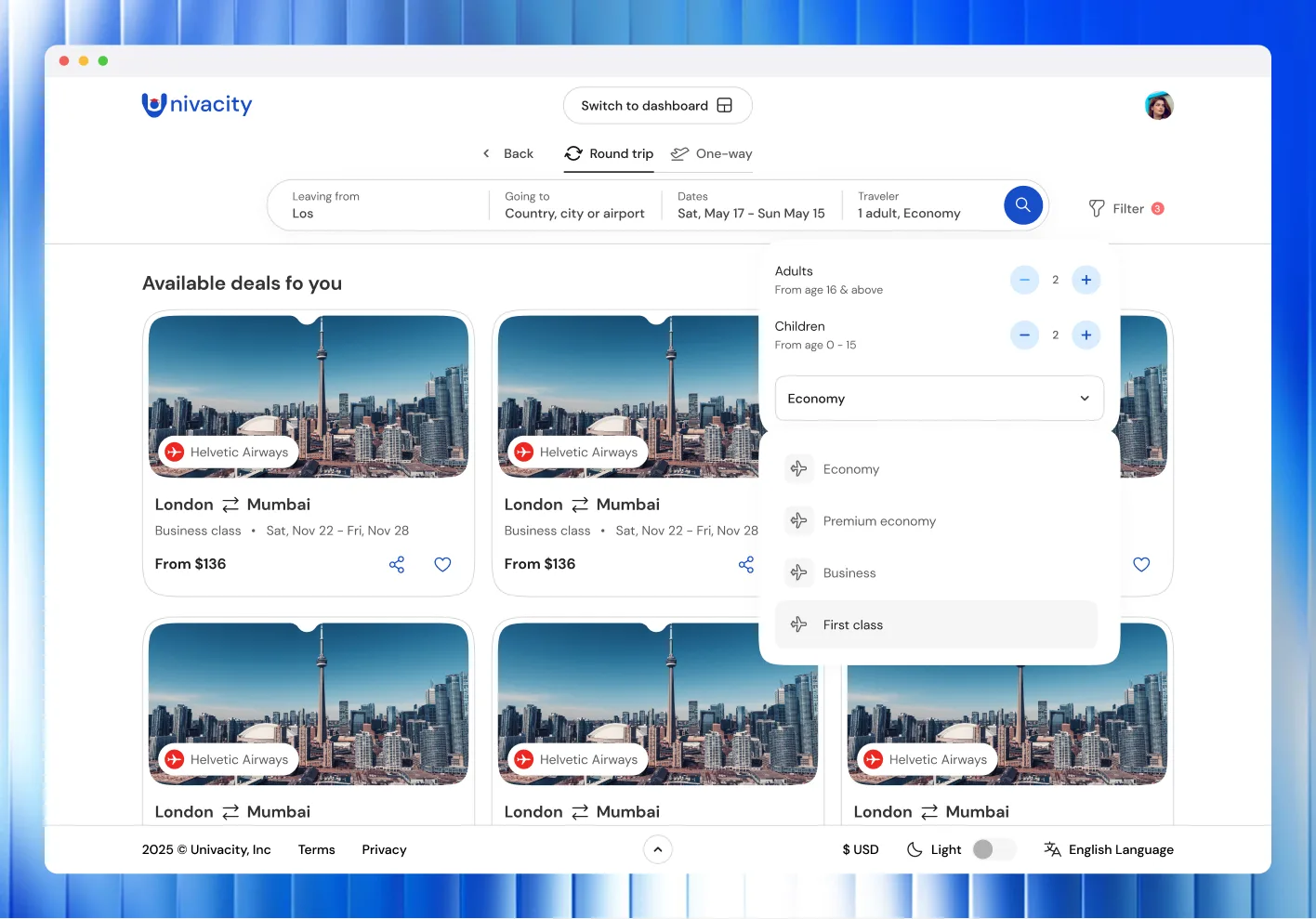
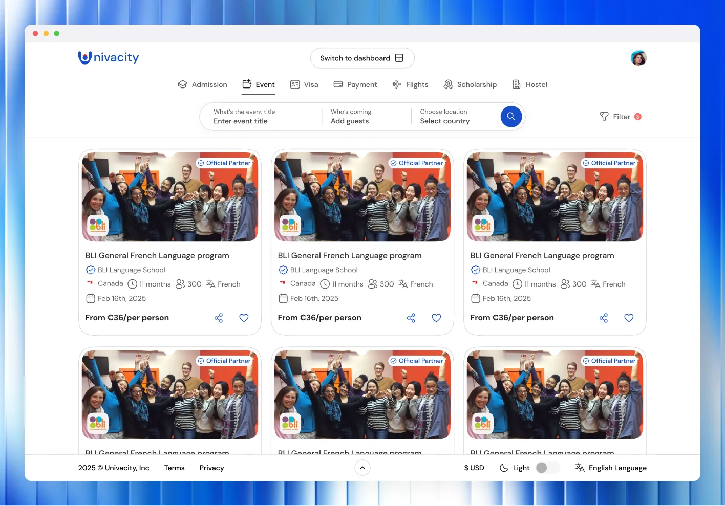
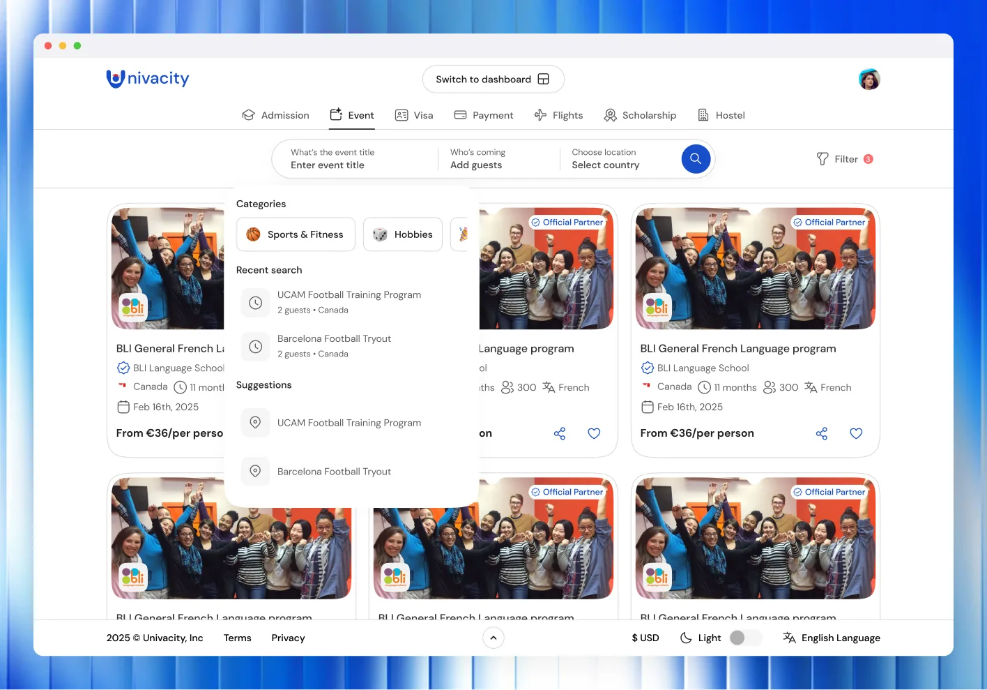
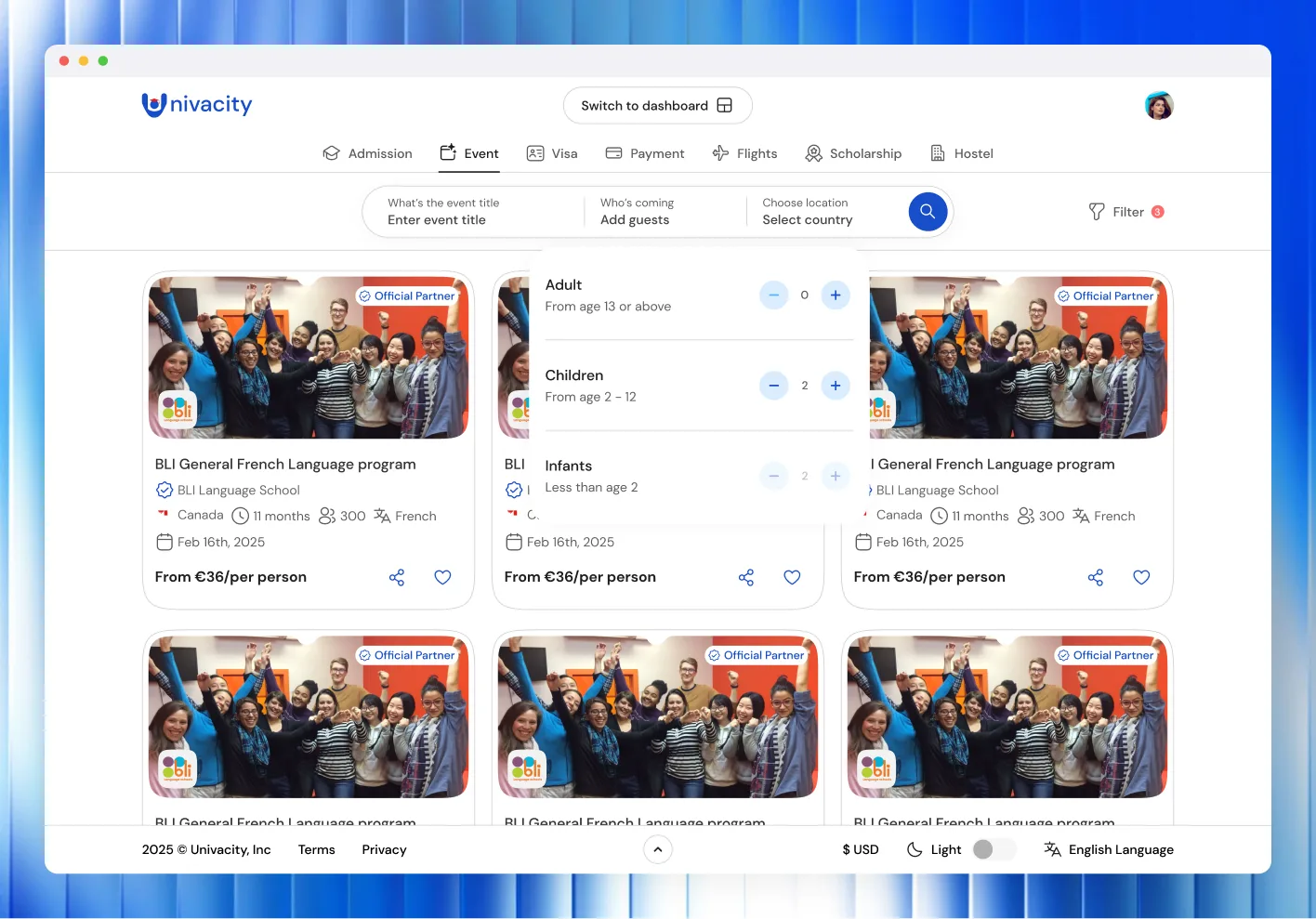
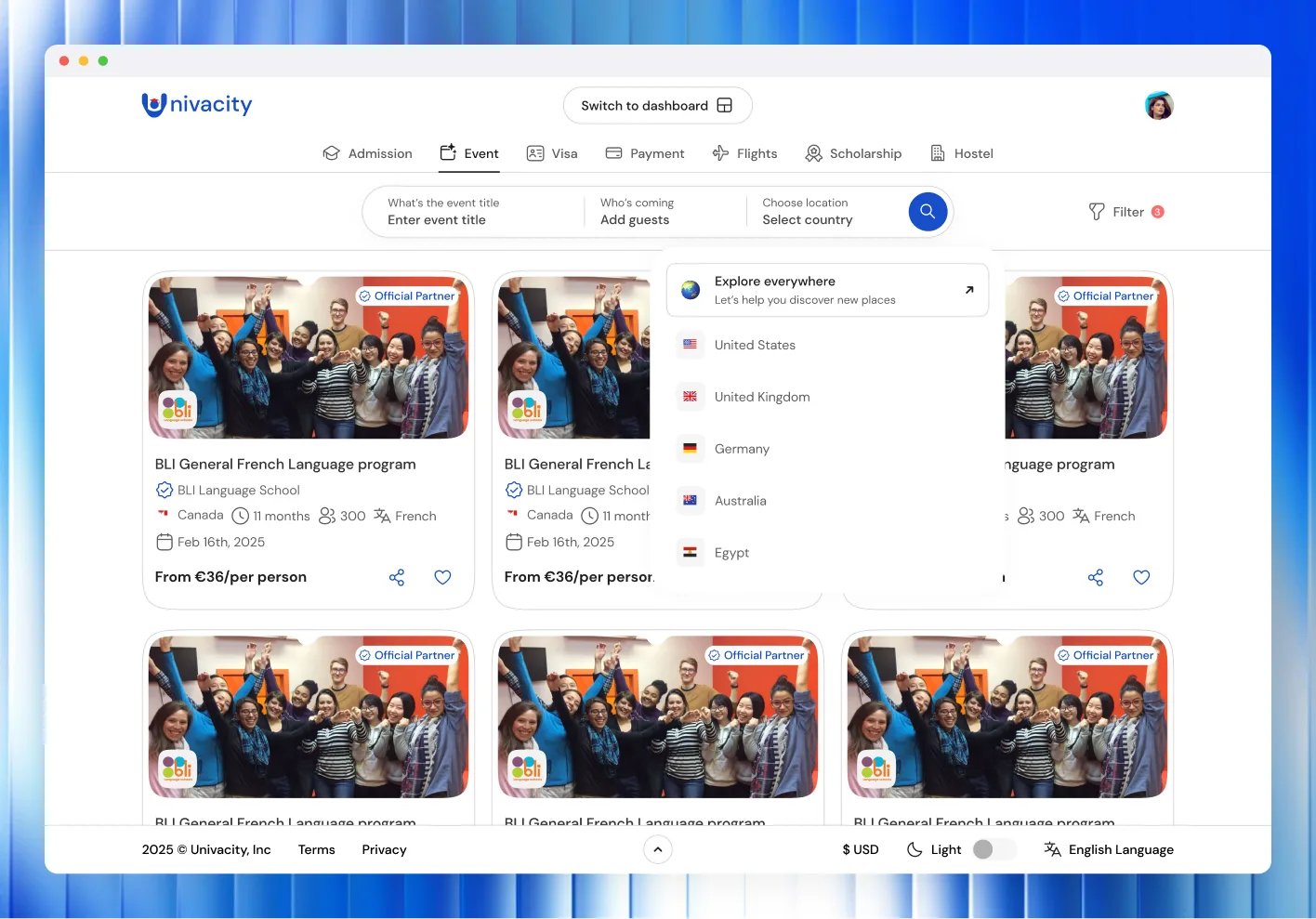
Admission, events, visa, payment, flights, scholarships and hostels sit in one row of tabs, and the search bar changes to suit whichever is selected: study field, level and country for admission; destination, visa type and citizenship for visa; origin, destination, dates and travellers for flights. Students never leave the platform to change what they're looking for.
Visa support
The hard part
Flights carry more state than anything else on the platform
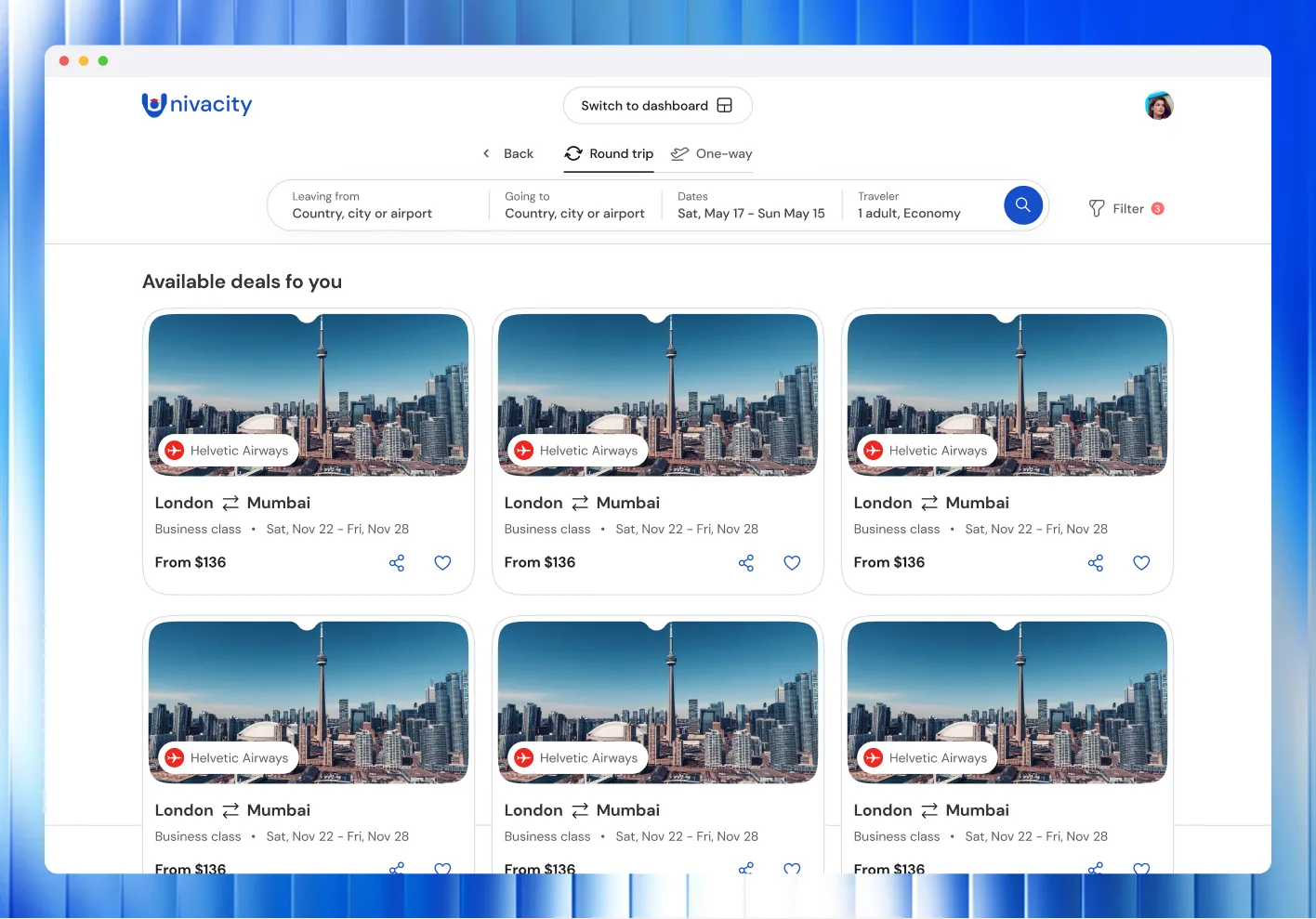
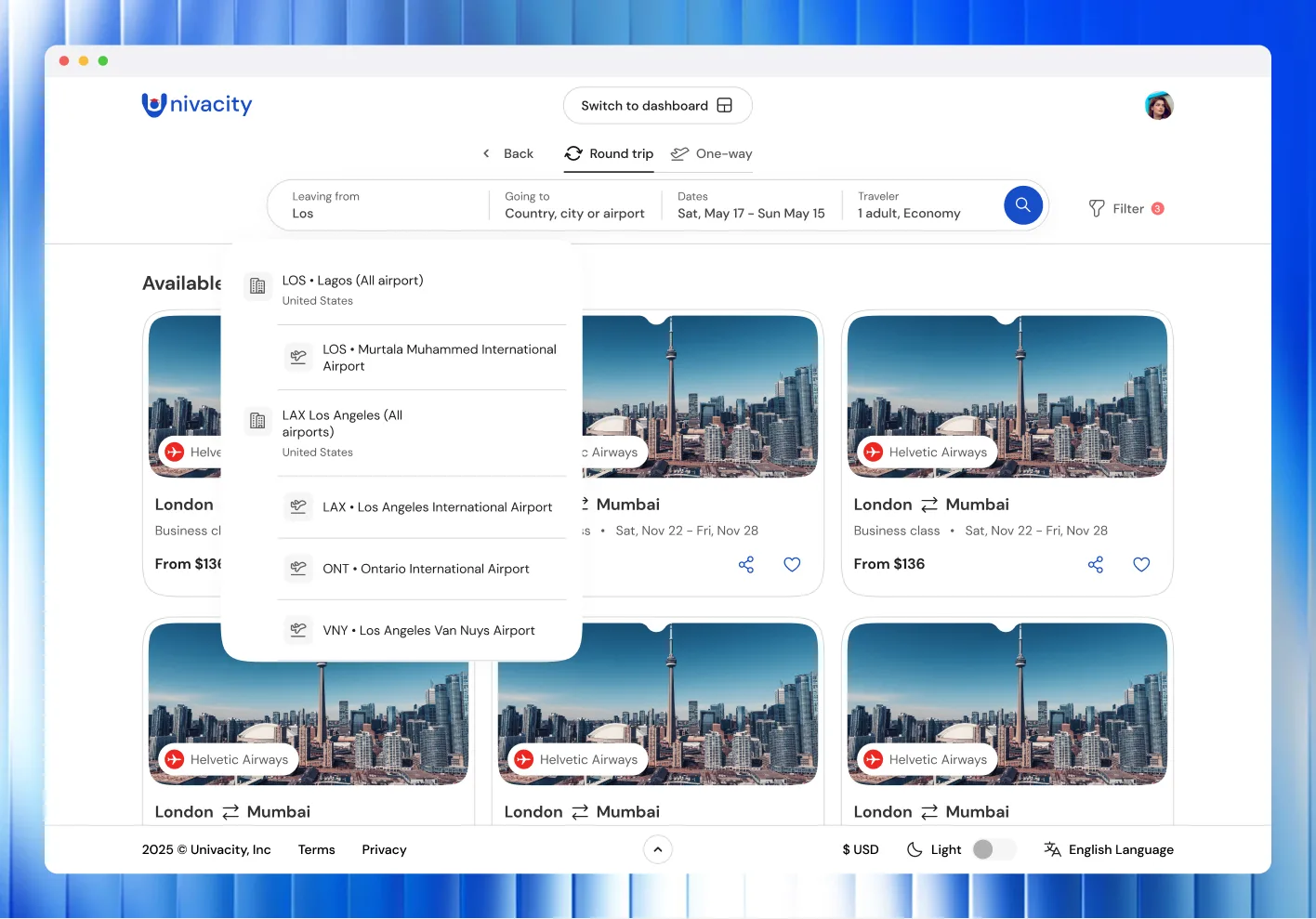
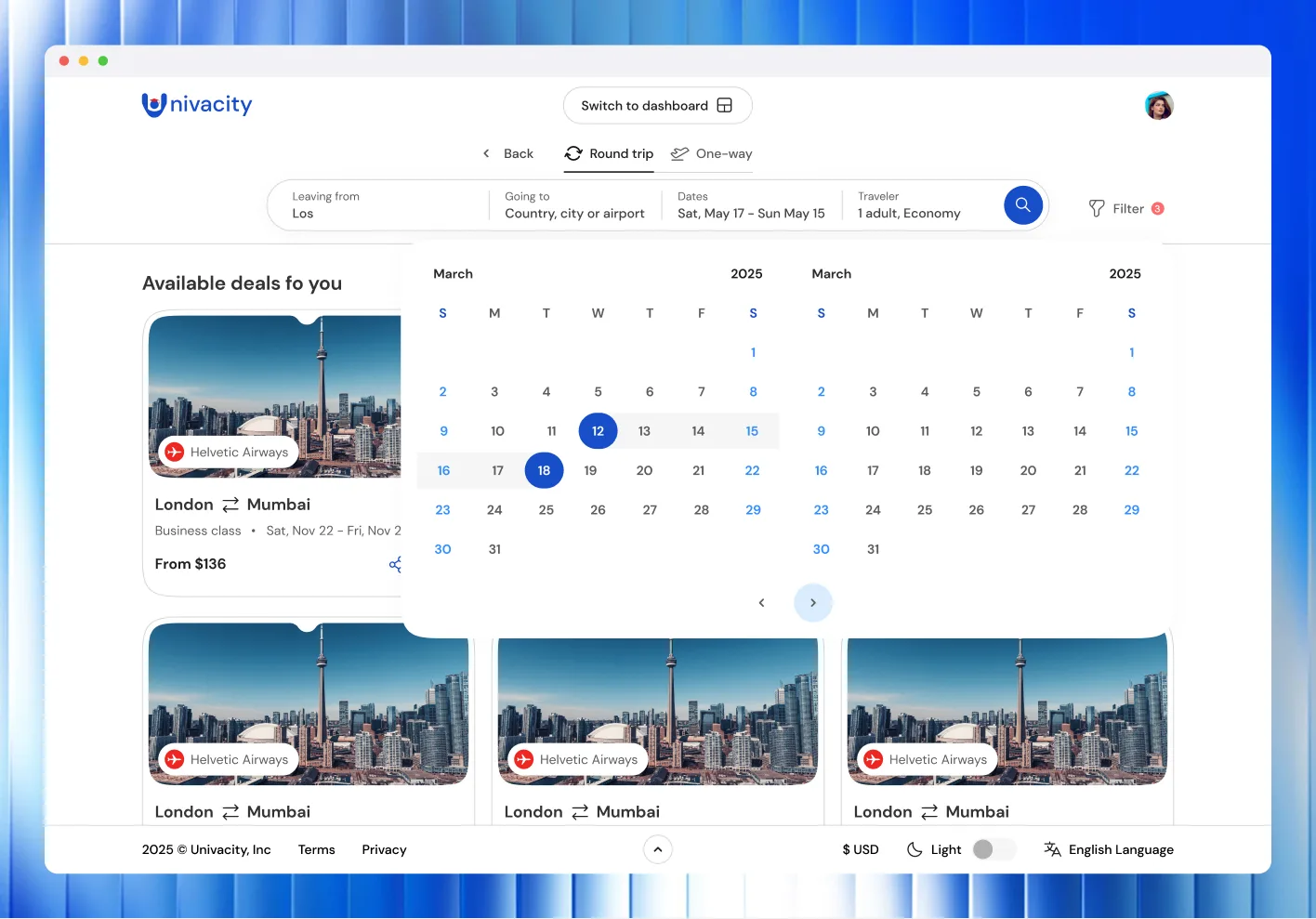
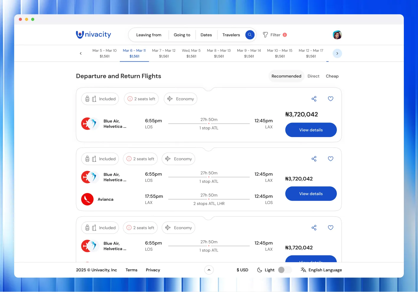
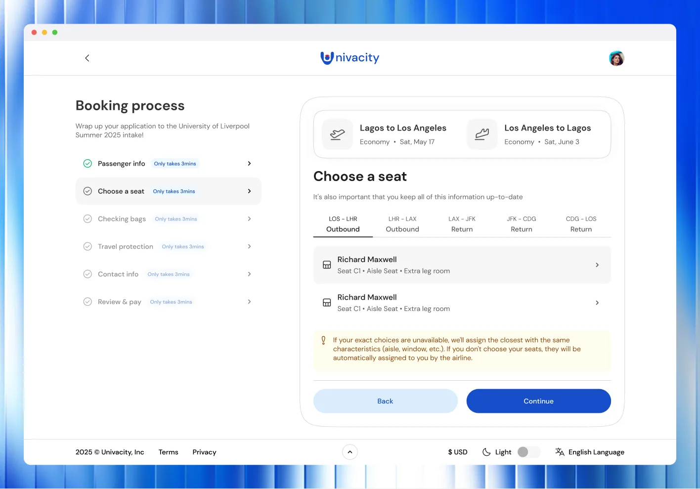
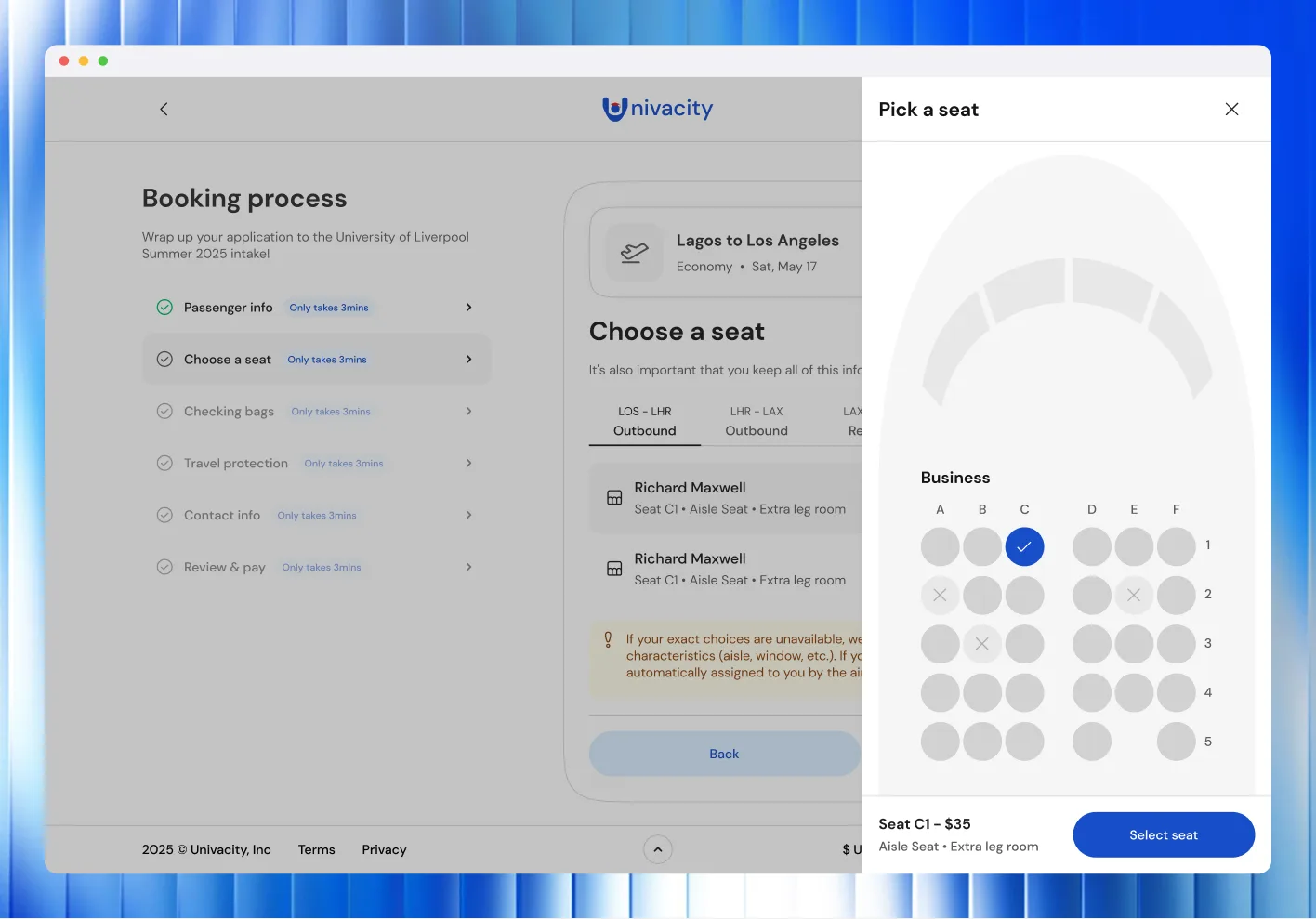
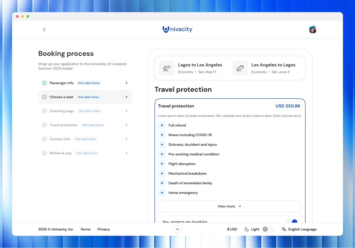
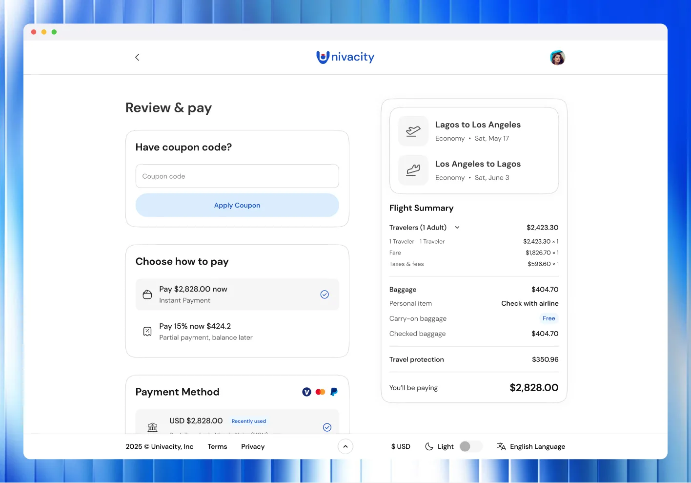
Flights were the hardest part of the web platform. The service had to behave like a booking engine. The search alone holds origin, destination, two dates, a cabin class and a passenger mix, and each one is its own panel: airport lists that separate a city from its terminals, a two-month calendar, a traveller counter split by age band.
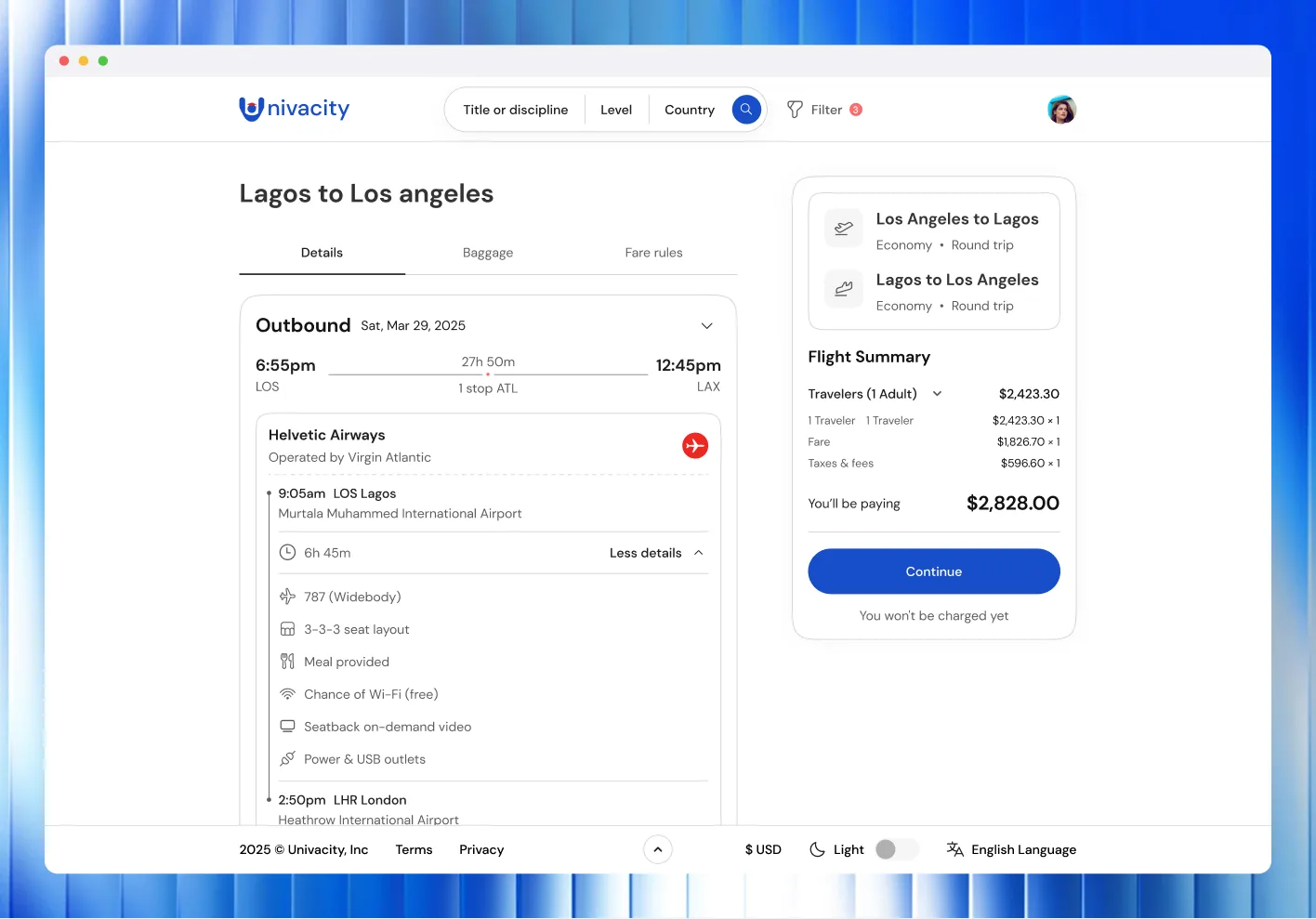
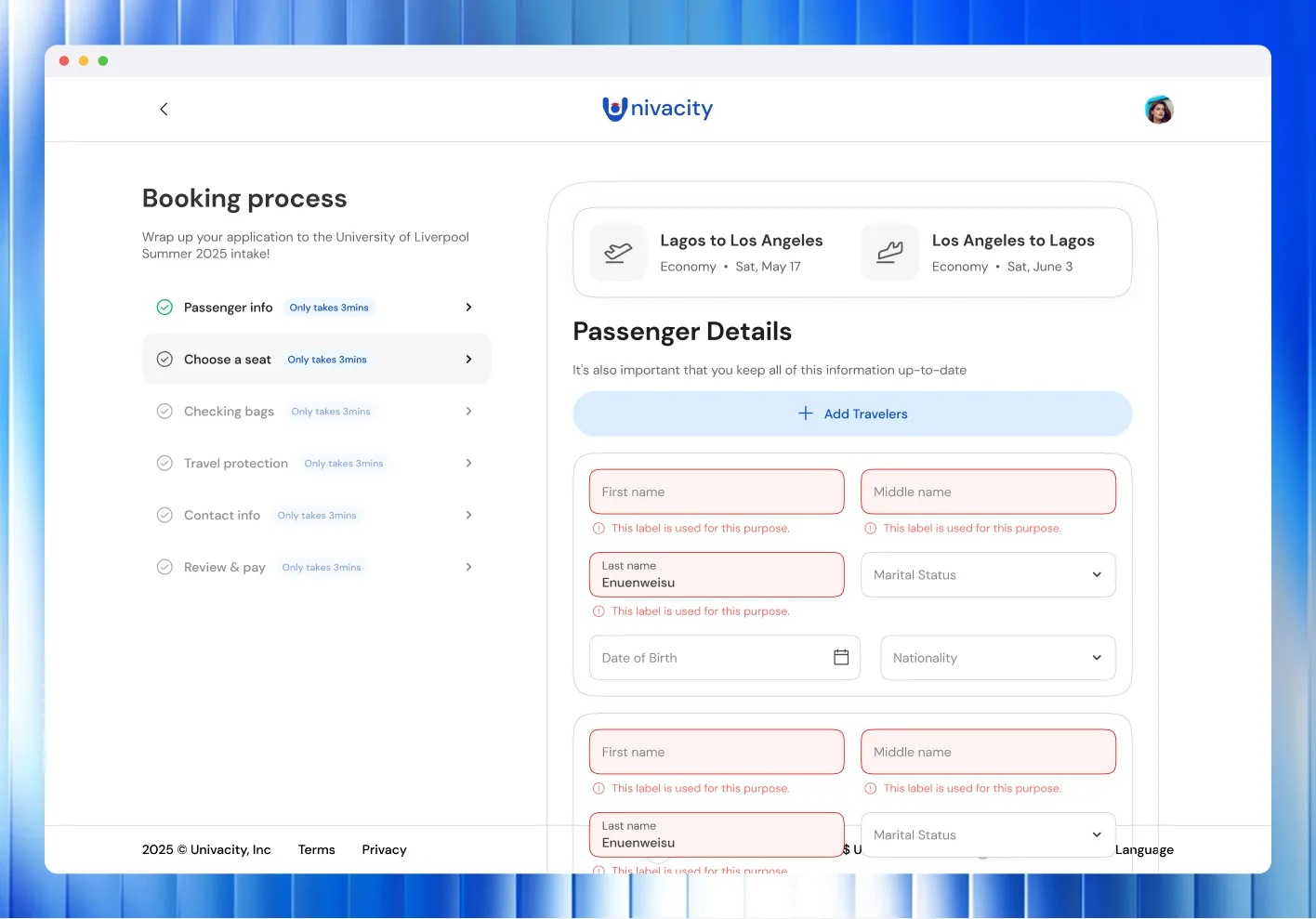
Past the results, booking is a second multi-step flow: passengers, a seat map for each leg, checked bags, travel protection, contact details, then review and pay. A running fare summary stays pinned beside it, so the price never changes without the student seeing why.
Events
Results
Support tickets fell 34% in beta
What we delivered:
- 90+ high-fidelity screens, covering applications, documents and recruiter pipelines.
- 180+ reusable web components, and 64 design tokens shared with mobile.
- Usability testing with 24 participants across 4 countries.
This project built on our redesign of the Univacity app. See Univacity.
Building something like Univacity? Let's talk about it.
Start a project
Tell us what you're building. A few lines is enough.
We'll read them, ask what we need to know and suggest a sensible first step.